A/B testing of ASO for seasonal events. Belka Games Experience
How exactly is the process of A/B testing of visual content for app stores built in Belka Games, – in his article for App2Top.ru the leading ASO-manager of the company Anastasia Personal told.
Anastasia is Personal
New art for the holidays is important
Updating the showcase for the holidays is useful for a number of reasons. Let’s focus on a couple of obvious ones.
Firstly, visual content prepared specifically for a specific “red day of the calendar” gives a good increase in conversion per season within the framework of advertising campaigns.
Secondly, it can also attract the attention of the editorial offices of the stores.
The fact is that their moderators often make thematic selections for a certain event or holiday. If you update the graphics on time, the game will have more chances to get into them, which means getting more features and, as a result, more organic traffic.
For example, our themed banner for the Microsoft Store for Valentine’s Day (Solitaire Cruise) was noticed by the store. We were included in the holiday selections, thanks to which we received 300% more organic installations.
Like all top companies, we organize events in games. By showing them in the showcase (and not just changing the design of screenshots), we increase not only the conversion to downloads, but also engagement: players who were attracted by the event are more likely to stay in the game with seasonal activities.
Making a calendar is the first step in planning seasonal updates
For all projects, we are preparing a calendar of holidays and events for which the schedule needs to be updated.
Important: in order for the work to go smoothly, we need to take into account the workload of artists, allocate time for tests.
Previously, it was impossible to change the graphics in the App Store without updating the build. That is, if the product has hard update dates, we had to adjust to them as well.
Now everything is different — you can update screenshots and videos using experiments without a build. But in any case, it is important for us to plan seasonal activities for all projects in advance.
Some of the holidays for which we are necessarily preparing a new schedule:
- Thanksgiving day;
- Halloween;
- Christmas;
- Lunar New Year;
- Ramadan.
How we prepare seasonal ASO
The content for each holiday goes through six stages.
- Generating ideas.
- Graphics development.
- Test.
- Application.
- Application analysis.
- B/A-a test at the end of the event or a graphics test for the next event.
I will not dwell on each of them. Everything is pretty obvious here, and our material is primarily devoted to testing.
I will only note that at the stage of generating ideas for creatives, we study trends in our genre and related niches.
As for the stage of graphics development, we usually use the best practices for previous seasons. If ASO has worked once, then you can test it again or lay the foundation for new content.
You can’t change content without tests
The seasonal schedule should not be hung up without first checking it as part of testing. Without it, it is impossible to predict the results of the update. The new graphics can equally increase the conversion rate and reduce it, thereby hitting the advertising budget.
So remember: any graphics must be tested.
In one far-away company, they somehow did not test banners for Ramadan, and according to all sources, the conversion rate fell by 10%. The volumes are small, but it was a little painful. Don’t do that.
Testing Tools
In the “Protein” for tests, we use:
- A/B tests in Google Developer Console;
- functionality for optimizing the product page in the App Store Connect;
- our internal testing tool that allows you to drive traffic to pages that simulate a store and measure the test results.
How do we test?
The testing stage is very complex. There are many points to consider here. One of them is how long the holiday will please users and at what point it will start to annoy them.
For example, families usually prepare for Christmas in advance, so tests can be run as early as the end of November. But it makes no sense to test the schedule for Valentine’s Day earlier than two weeks — the period of relevance of the holiday is very short, so you can even go into negative according to the tests.
Practice shows that it is better to run tests on each geo separately. This way you can use the creatives that are most suitable for the location. Plus, it is more convenient when interpreting the results.
We usually test the graphics on the main geo, which account for the largest share of traffic and revenue. Often in different countries, the leaders in the tests differ, and then we use different options.
Since there is no way to use different icons for different geo in the App Store, we do this:
- we use the icon option, which was the leader in the tests in most geo;
- or we use the leader icon from the geo test, where it is most important for us to get a conversion increase.
Practice has shown that in both cases we get an increase in metrics (or retention at the level) in all significant regions. But this approach has its drawbacks. For example, Christmas is celebrated in Christian countries, but not in Asian and Muslim countries. In this case, it is better to test the icon with a Christmas tree and toys in the relevant countries in advance, so as not to harm the conversion of the product.
Cases
Christmas and Lunar New Year — Clockmaker
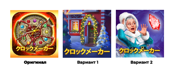
We tested the Christmas schedule not only in Catholic countries, but also in Japan, where, it would seem, there are practically no Catholics. And we were pleasantly surprised by the results.
Here are the test results.
Both new Christmas-themed icons have shown growth in Japan. Option 1 showed an increase in conversion to installation of 7%, option 2 — plus 11%.
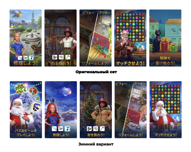
The winter set of screenshots with snow and Santa gave a plus of 10% in terms of conversion to installation.
The Christmas version of the banner also gave a conversion increase of plus 5%.
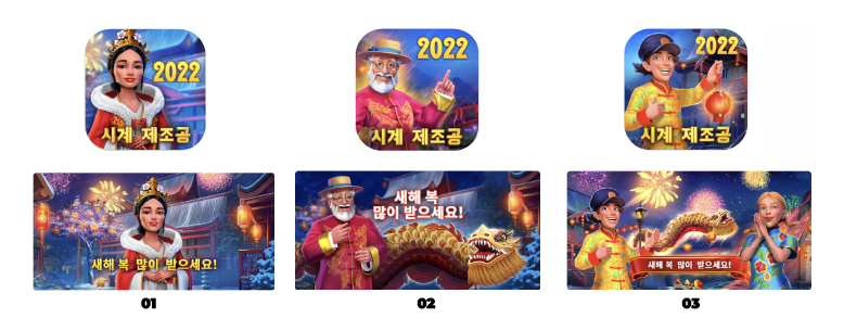
And here, for example, what happened with the Lunar New Year. We have prepared graphics for Asian geo and tested both the icon and the banner at the same time.
In Japan, option 02 (plus 20%) proved to be the best, in Korea — 01 (plus 16%).
But we decided to check how the graphics will show up in other countries. We were pleased with the results. USA, Germany, Russia — everywhere the second option showed an increase of 14%. But in Britain, oddly enough, the options worked even worse than the original showcase.
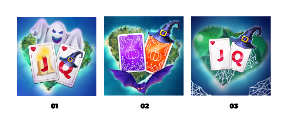
Halloween — Solitaire Cruise
We have developed three versions of icons based on the current one and started testing two weeks before the holiday.
All three options played a plus, but the largest increase was given by icon No. 2 — plus 12%. This is a good result. But is it possible to increase it? We decorated the leading version and tested three more icons:
The first icon in the test showed an increase of 20% — much better. We applied it.
The whole process was completed in two iterations. In the first iteration we brought out the leader, in the second we tested the derivatives obtained from him.
This separation of the process saves time perfectly. There is no need to wait for the tests of all variants to end — you can take the one that has shown itself best, modify it and test the already updated versions. The disadvantage of this approach is that it is more difficult to evaluate the results of the application.
The analysis of the application of the icon showed an increase in conversion in all geo applications. The largest growth was in Germany and the USA — the conversion rate for all traffic sources increased by 20%. But in Russia, the results are not so impressive — only 4% have been added.
It is important to know when the holiday is coming to naught. Two weeks after Halloween, we watched the conversion, there were no decreases. And on November 15, an A/B test showed that the original icon works on a par with the thematic one. So the user’s interest in the holiday has faded. It became clear to us that it was time to fold. We have returned the original icon to the store.
Christmas and Valentine’s Day — Bermuda Adventures
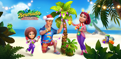
Bermuda Adventures is a farm/adventure about the life of a family on a tropical island. We have prepared winter versions of banners for her, and then icons.
Surprisingly, none of the options showed an increase in conversion in the tests. Most likely, users did not see in the graph what they expected from the game. There is no hint of a farm in the banners, and the island theme has disappeared.
But we had another option in store.
He showed in the test an increase in conversion to plus 7%. Success!
Then we moved on to the icon test.
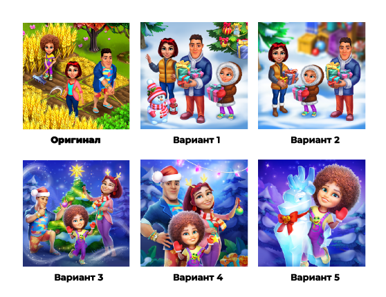
The icons in the test performed worse than the current one. Most likely, for the same reasons as the banners. Then we have prepared options that are close in content to the current one:
We started the tests at the end of November (it’s worth preparing for Christmas in advance). According to the results of the tests, the first option showed an increase of 10% in all geo. On December 15, we successfully applied it.
At the beginning of January, we had the idea to test the inscription on the icon. Added the laconic “2022”. According to our hypothesis, the indication of the year could convince users of the relevance of the game, encourage them to download to check for updates.
It worked. The new icon gave a plus of 10% to the conversion to the installation. That’s why we put it up.
Time was approaching Valentine’s Day, and we decided to prepare themed icons and banners.
In addition to the holiday reference, the prepared graphics continued the romantic theme of our most performing UA creatives, which could have a good effect on IR.
All variants of icons worked worse than the winter one. There could be several reasons:
- the icons turned out to be too “mislide”;
- the icons did not reflect the essence of the application;
- “winter” graphics are still relevant and more interesting to users than romantic and more spring;
- there was no inscription “2022” on the icon (we prepared them before the start of the test of the second winter icon).
In addition to the icons, we have prepared two themed holiday banners.
In the test, they showed themselves in different ways:
In Germany and France, the first banner was in the lead — plus 17%, in Russia the second one was popular — plus 10%.
Oddly enough, in the USA and the UK, the graphics did not go, showing 0% growth and complete indifference of the audience. They did not apply it — they continued testing other options.
Ramadan — Solitaire Cruise and Clockmaker
In our games, we are preparing updates for the main Muslim holiday — Ramadan. We have had content tests in Turkey, Saudi Arabia and the UAE.
For example, this is what the Solitaire Cruise banners we tested looked like:
Banner 01 was the leader in all Muslim geo — it gave a 10% increase in installations.
There was a much more interesting story with Clockmaker. We tested the following creatives:
With a fantastic lead, the second option won. It showed a 40% conversion rate increase.
Where do these numbers come from?
Our hypothesis is the following: in Ramadan, Muslims fast all day — they don’t even drink water. Only in the evening comes the time of the first meal.
And just during this period, we give them a live picture, where both the evening and the richly laid table are read. The first option, although it sets up in a proper way, but it looks much simpler, and does not lead to a targeted action.
By the way
Sometimes we use ASO, which did not show an increase in conversion, but passed the tests on a par with the current version.
Firstly, this is how we demonstrate to users in the store that our games are actively working on graphics and new functionality (and in general there are changes).
Secondly, it helps us to work on retargeting. Current users will notice a new icon with a Christmas tree and toys and may want to go into the game and check out what’s interesting.
Conclusion
Our experience in testing the visual components of ASO can be summarized as follows:
- it is better to test all seasonal changes in the schedule in advance so as not to reduce the conversion rate;
- seasonal ASO works not only for conversion, but also for the involvement of players, if you hold events on the topic in the application;
- each holiday has its own period of relevance, and this should be taken into account. And after the end of the holiday, you need to run reverse tests with the previous graphics, so as not to miss the moment when the holiday starts to get boring;
- preferences vary from country to country, so it is better to conduct tests separately for each geo (if you want your ASO to work 100%, of course);
- it is a good practice to use two iterations in tests: quickly test the first options, choose a leader, improve it and conduct tests for derivative options;
- one indication of the year can give plus 10% to the conversion;
- consistency is important. If the product positions itself as a farm on a tropical island, the farm indicator should be on the icons, and the island indicators should be on the banners: sand, palm trees, sea.


