ASO Dashboard is coming out. It will help you work with traffic on iOS
In the spring, ASOdesk introduced a new traffic analytics tool for iOS applications – ASO Dashboard. It’s coming out for release this week. Dmitry Kofman, ASO Director at Gambino Slots, talks about the tool itself and working with it.

Dmitry Kofman
The beta version of ASO Dashboard was launched in March.
This week it goes into release. In short, this is a control panel that integrates with the App Store Connect, loads data from there, allows you to group them according to a wide range of criteria and at the same time visualizes everything.
In other words, it seriously simplifies working with application data that comes from the App Store. For example, earlier our work was structured as follows:
- uploading reports from the console;
- we collect giant Excel tables on their basis;
- we work with them.
It’s not very difficult, but when you want to get a visualization of all the information received (which is necessary for analysis), problems begin. ASO Dashboard solves them for us.
What can the service do?
Analytics by day
1. Track unique installations, interactions, page impressions in the store and the ratio of conversion to installations. Immediately, ASO Dashboard displays everything on one chart.
What for?The most interesting thing with applications happens after the metadata is replaced.
The most important thing is to immediately analyze how much the conversion rate has increased or decreased. On the daily reports, you can immediately see the conversion changes to the installation.
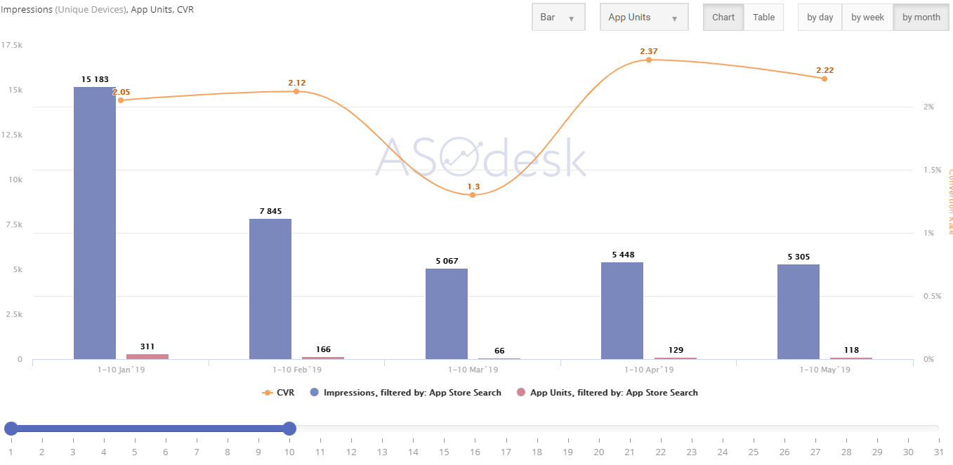
Example of a daily report in the table (imp/installs/CVR)
2. Analyze the conversion by country.
What for?You can select several countries that are important to you and analyze the data only for them.
For example, on one of our projects, we replaced metadata only in Thailand and then observed the dynamics only there.
3. Compare the effectiveness of different traffic channels.
What for?The main task is to see the impact of purchased types of traffic on organic.
Today there are many different channels where you can buy installations. However, it is often difficult to predict how its acquisitions will affect organics. Therefore, traffic must be constantly monitored in order to remove inefficient channels.
Plus, it is important to track the conversion rate. If you buy low-quality traffic, then a solid part of the source clicks will go exclusively to page impressions, which have a very low conversion rate to installations. Because of this, the conversion rate will suffer greatly, which means that the application’s position in the search will also fall.
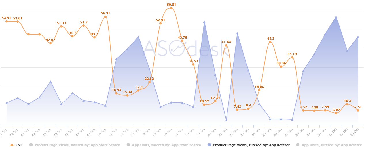
We see how page impressions from advertising traffic are growing, while they kill the conversion.You can also see viral traffic from YouTube or from any other site.
This makes sense if we are talking about evaluating the effectiveness of advertising campaigns with the participation of influencers.
4. Compare cohort data by day.
What for?Using this function, you can compare similar time periods with each other.
For example, the user can choose from the 1st to the 4th day of each month, and the graph will display the number of installations / impressions and conversions for the selected periods.
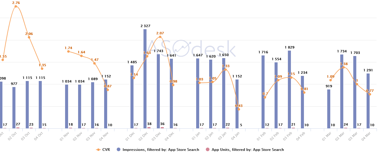
Immediately, the conversion (and other data) can be output in an aggregated form to see how, for example, the situation changed in the first days (or in any other) of each month for, for example, six months.
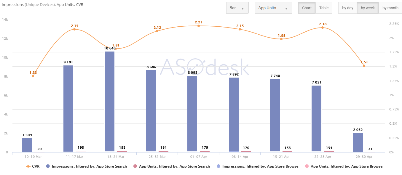
Analytics by week
The same data is displayed here as in the daily reports, only they can be grouped by week. Here the conversion is visible without strong fluctuations that may be present in daily reports.
Analytics by month
On a monthly basis, you can set KPIs and further tasks for ASO and PPC managers. For example, show App Store Search and App referer installations on the same graph and see the correlation.
If advertising traffic helps organic, then you can calculate how many paid installations you need to add to further increase organic, and set a clear KPI for the next month or other necessary period.
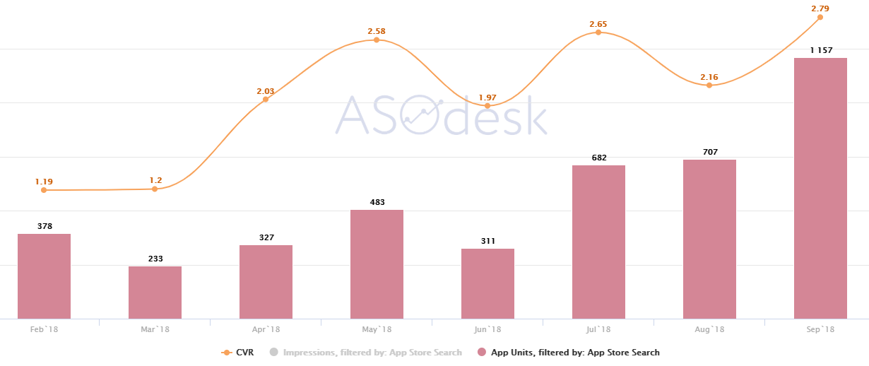
On the graph, you can see how installations and conversions are growing from month to month. Based on this data, you can build a KPIAdditional features
- ASO Dashboard can output data as charts, tables, and also upload everything in .xsl format.
- You can compare data on the ratio of unique installations (Installs) to non-unique (App Units). But here’s a caveat: the data is not always representative, since information about non-unique installations comes only from those users who have agreed to share information about their statistics with the developer.
***
To connect the trial version of ASO Dashboard, leave a request here.