Worlds squared: a guide to creating icons for mobile games from Social Quantum
Experience working on icons for the game “Megapolis” in your column for App2Top.ru Ilya Klushin, a leading 2D artist at Social Quantum, shared this.
 Ilya Klushin
The icon in mobile games is one of the most important elements of ASO. It is she who attracts the eye of a potential user, forms the first impression of the game and helps to decide whether to download it or not. Therefore, special attention should be paid to the creation of the icon.
In this article, using the example of creating an icon for the Megapolis bodybuilder, I will tell you how to work on such content.
1. Analysis of other people’s icons in the store, the formation of a common idea
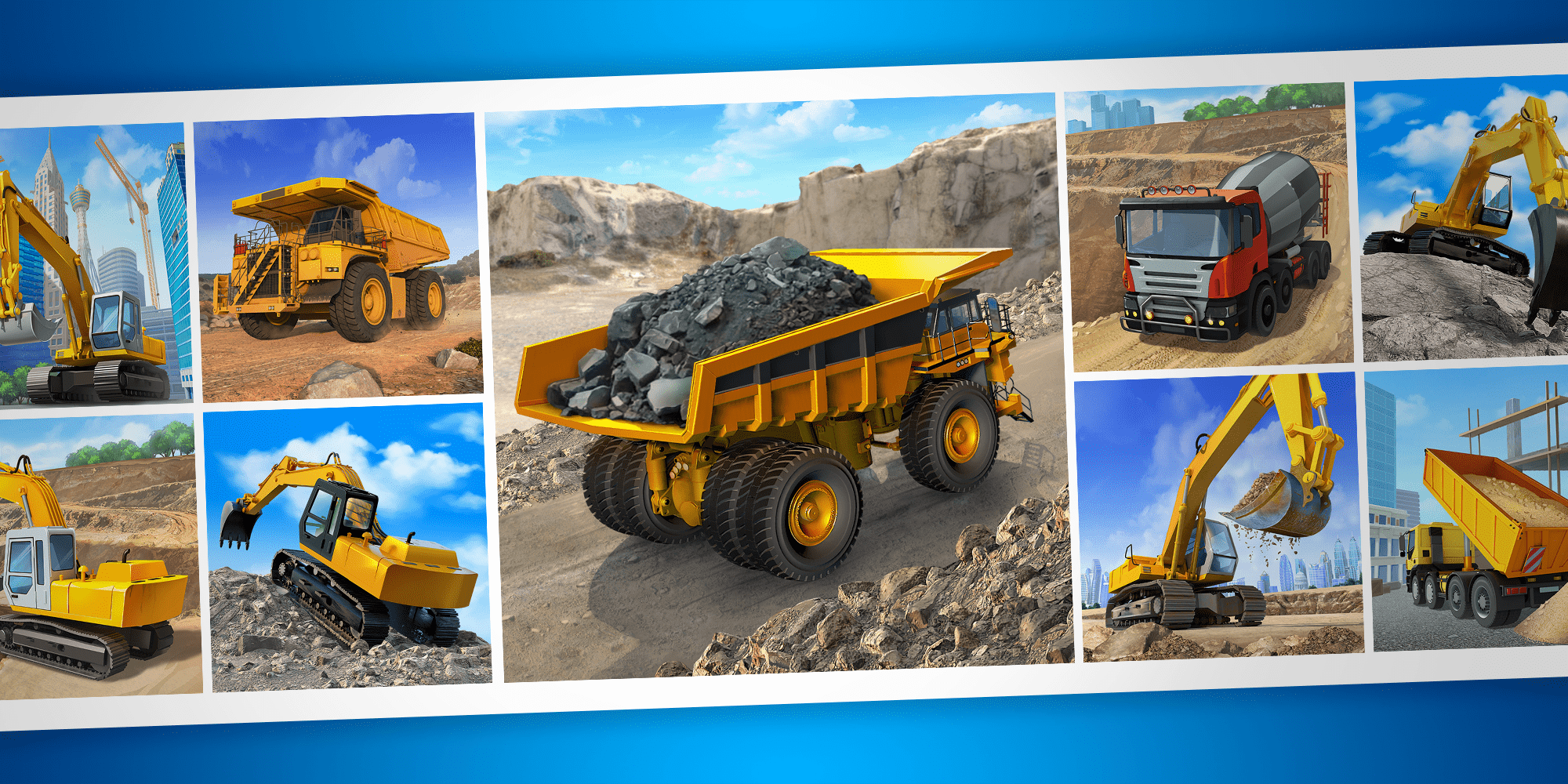
My work begins with studying icons for analog games in the App Store and Google Play. We search for them by keywords, look at them, choose the appropriate ones. Next comes the analysis of the collected results.
When working on the icon for Megapolis, I quickly discovered that most of the bodybuilders on the icons can be found:
- urbanized landscape;
- buildings under construction and high-rise cranes;
- characters in helmets;
- bluish-blue color scheme.
I didn’t want to deviate much from the general idea of the city’s development. At the same time, it was important that the icon still stood out against the general background in the construction niche.
As part of the discussion with colleagues, it was decided to focus on the idea of depicting construction equipment against the background of a city or an industrial location with a quarry.
2. Preparing icons for the test
At this stage, a large number of icons are being prepared for the test. How exactly they are created, I will elaborate a little below when I talk about how we came to the current icon of the “Megapolis”. Now we keep in mind that after choosing an idea, we try to implement it in various ways.
3. A/B testing
Testing is carried out in several stages. On each, the indicators of similar icons are compared.
In the case of Megapolis, we had four stages of A/B testing.
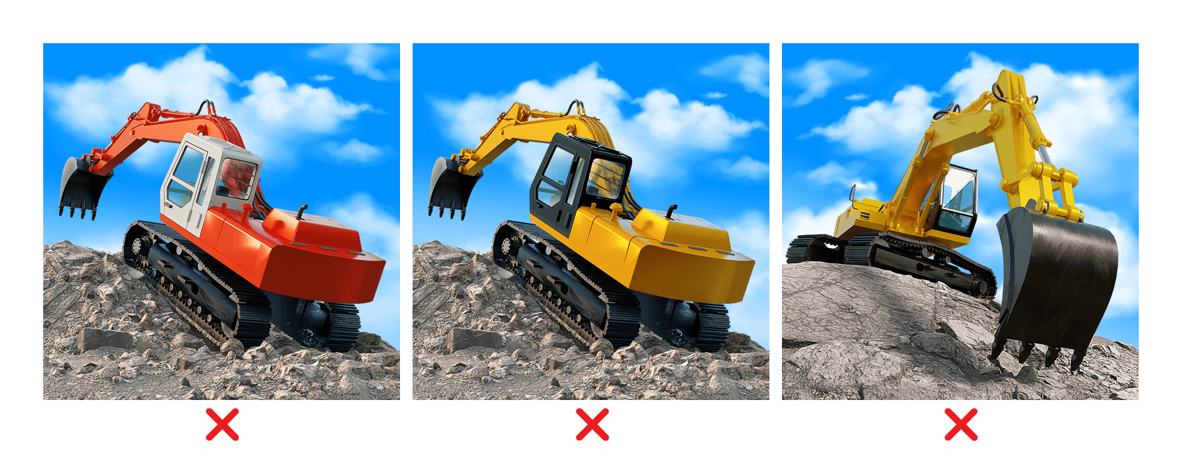
I) First, we tested different versions of construction equipment against the background of an urban location.
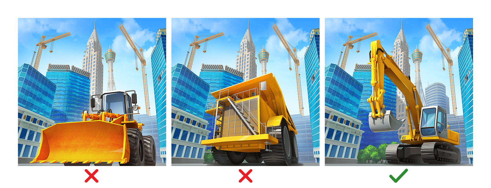
The best result among the first test pool was shown by an icon with an excavator.
II) Next, we turned to technology against the background of a quarry/construction site.
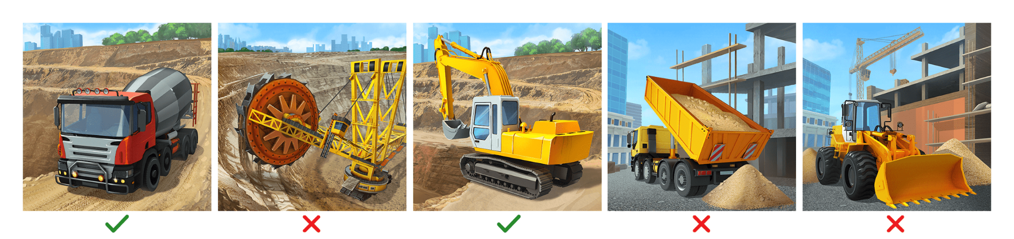
An icon with a red concrete mixer and an icon with an excavator on the background of a quarry showed significantly better results than icons with a city construction site. Therefore, we prepared the next iteration of icons only against this background.
Immediately, the rotary excavator and the bulldozer were finally eliminated. For the next iterations, we decided to try Belaz (as a replacement for a dump truck) and an excavator.
III) We have prepared a new pool of icons. This time only against the background of a quarry and exclusively with two types of equipment — a belaz and an excavator.
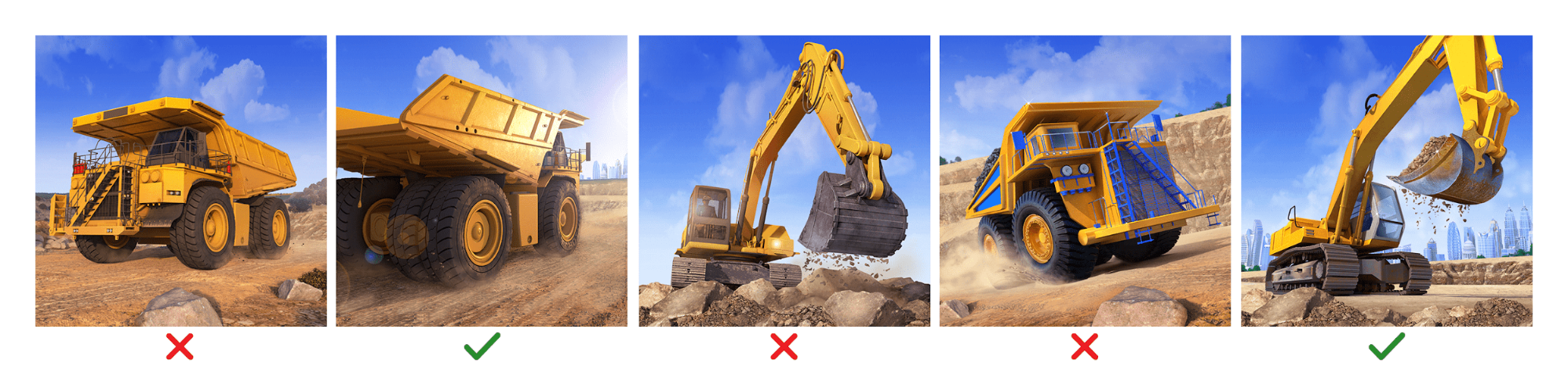
Belaz, shown in traffic on the road, won. An icon with an excavator whose bucket is full of gravel, according to the results, turned out to be close to it. But additional tests with this type of equipment were needed.
IV) We “drove” icons with different versions of excavators, “played” with the angle.
The variant with a yellow excavator and a black cab almost approached the results of Belaz from the previous stage, but still showed a lower conversion.
4. Analysis of previous tests and collection of references for the new icon
So, we conducted A/B testing. Thanks to this, we have data with which it became possible to work, on which it turned out to be possible to draw conclusions. They were as follows:
- the icon should have a road with a belaz moving away from the viewer;
- dust from the wheels should not be shown;
- the technique should be made in contrasting colors;
- the body must be filled with ore, coal or any other suitable resource present in the game;
- the color scheme should be something in between the palette of 3 and 4 stages;
- the icon should have the sky on it.
We transferred all this information to the text TK and moved on to collecting references. Some of them were taken from the task, some were found on the web.
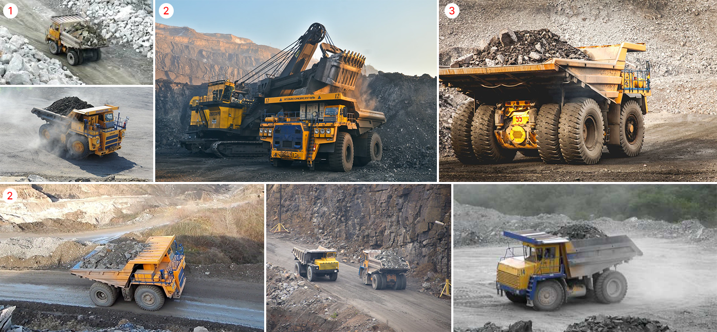
References from the network came in handy:
- from the photo (1) we took the idea to launch a dump truck on the road between the stones;
- we borrowed a color gram from the photo (2);
- from the photo (3) we took an approximate angle of the movement (at the same time, we initially wanted to raise the camera higher and show the side of the belaz more strongly).
5. Search and preparation of a model of equipment
Now let’s talk about the process of creating icons.
In the modern industry, it is impossible for a 2D artist to do without using 3D programs. They help the artist to quickly create a sketch in several angles with a different composition of elements.
As for the specific icon with Belaz (and before that — with other equipment), we did not have to prepare a model from scratch. We had a large number of low-poly models from the game at our disposal, plus a set of high-poly models (including the Belaz model that was used to create the icon for testing). Usually these models are used for promos (videos, posters and other similar tasks).
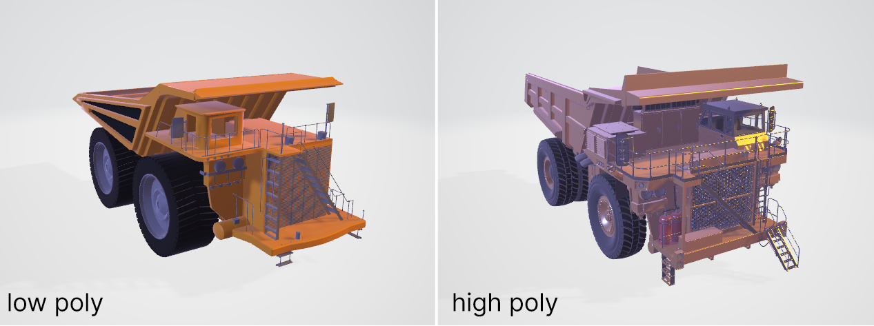
The low-poly model did not suit us. The truck on the icon was supposed to be the main element of the composition, so we wanted it to be as detailed as possible.
What’s next?
- We started working with the model in fbx format, exported with all textures preserved.
- In addition to the dump truck, we needed the quarry itself. Here we had a choice: we could either choose a suitable HDRI card, or add a render of the desired surface to the scene, or use a photo pencil.
- We started looking for a suitable angle and lighting using Blender, but you can use ZBrush or any other 3D program at hand.
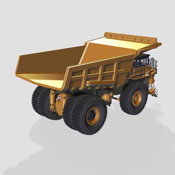
6. Foreshortening and lighting
The perspective is two-point. We selected the camera angle so that it was slightly behind and to the side of the model. It was necessary to show equally well powerful wheels, body stiffeners, suspension parts and a body filled with ore. A small hit by the camera on the near wheel gave the image additional dynamics. A clear separation was made between the wheels (otherwise, when the icon was reduced, they would merge into a single whole).
A three-point lighting model was used for lighting. By exposing the lighting sources on the model, we tried to reveal the shape of the object as much as possible. We did not forget about the HDRI card. This was necessary in order for the necessary reflections to appear on the materials of the object.
7. Overlay icons
We usually do the composition assembly in Photoshop. We transfer the rendering of equipment and landscape there. We added the coal rock in the body and the cobblestones in the foreground through the photo tower. The layout was prepared based on the proportions of the adaptive template for Android in order to have a sufficient stock of background for further redesigns of the icon.
The overlay should solve the problem of highlighting the main element of the icon. To do this in our case it was necessary:
- improve silhouette readability;
- simplify forms, reduce detail;
- make the image more contrast;
- mute the background and surroundings.
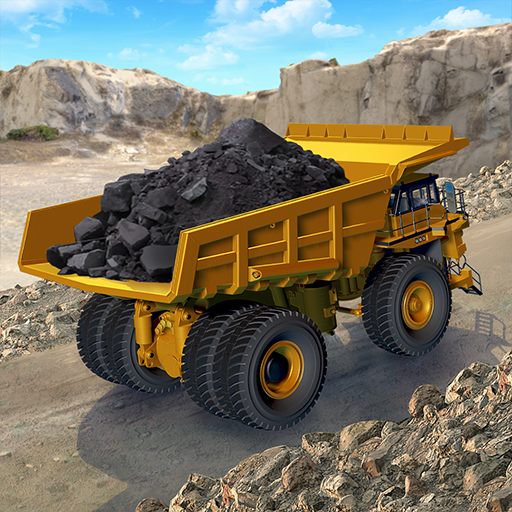
The icon’s problems were not limited to this. The horizon was too simple and flat on it. The long-range plan turned out to be diluted with verticals. There was also no feeling that the car was rising from the depths of the quarry to the surface. Therefore, a more interesting, picturesque line of the quarry walls was selected, the edge of the road was shown, behind which the background is visible, the clouds were reduced.
Then we continued working with the long-range plan and the environment. They added a falling shadow at the walls of the quarry, lightened the bottom and took everything into an aerial perspective. The road was revived by adding the texture of gravel and furrows from the wheels to it. Darker cobblestones were added at the edge of the road. The center of the road, on the contrary, was made a little lighter. With the help of Photo Filter, warm yellowish shades were added to the entire environment. Additionally, the far and foreground were blurred through Lens Blur so that the focus of sharpness fell on the car and the road.
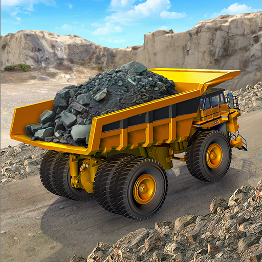
After that, we got busy with the dump truck. The details and unnecessary planes of the model were reduced, which led to a better reading of the shape when the icon was reduced.
Important: icons based on highly detailed images always need to be adapted for a small format, make sure that they do not lose their external attractiveness at the same time.
In this case, we have simplified/removed the following elements:
- the top of the body (to look better against the background of the quarry wall);
- stiffeners (to be better read when the icon is reduced);
- an extra glowing spot that argues with the body and wheels.
- an extra black element, the yellow oval is clearer and clearer.
After that, the silhouette of the car began to look better against the background of the landscape and the road on the principle of tone contrast.

We also added a black stripe on the side to separate the upper part of the body from the side.
What else?
With the help of Brightness/Contrast and Vibrance, the contrast and saturation of the main colors — yellow and black – were tightened to achieve cleaner and juicier shades. Excessively active shadows at the bottom of the body were corrected using Shadows/Highlights.
The pile of rock was more accurately inscribed into the body, the contour was corrected, the chiaroscuro was worked out and taken into cold shades using Hue / Saturation. Added reflexes from the sky and the body. This made it possible to visually separate the breed from the tires by color.
Then they added textures to the surfaces (metal tires, rubber and headlights), enhanced the reflection of the sky in the side mirror and the glass of the cab. The shadow falling from the car was slightly softened so that it did not merge in tone with the tires. The reflexes on the body and tires were strengthened, highlights were emphasized in the right places with the help of Color Dodge, and in general, the atmosphere was tightened to a single whole.
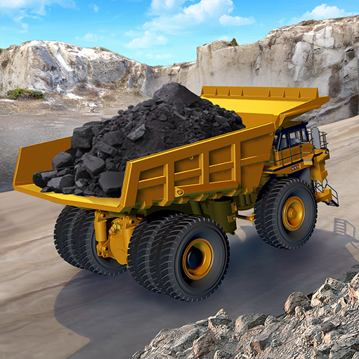
That’s how we completed the work and received the final version, which was sent to the stores for the test along with the rest of the pack icons.
8. Testing the icon’s usability
In the end, let’s focus on testing how the icon looks in the OS.
Such testing should answer the following questions:
- What does the icon look like on various devices? Let’s see how the icon looks on screens of different sizes. For the smallest sizes, even more simplification may be necessary.
- What does the icon look like from its smallest to its largest size?The exact size of the icons will help to catch the problems of “blurring” or “gone pixel”.
- What does the icon look like on white, black, gray and other backgrounds, as well as on various wallpapers?
- What does the icon look like among other apps in stores?
Unfortunately, there is no universal online service that checks the icon in all the necessary sizes. The existing solutions do not integrate with the main tools of work (Photoshop, Sketch or Figma).
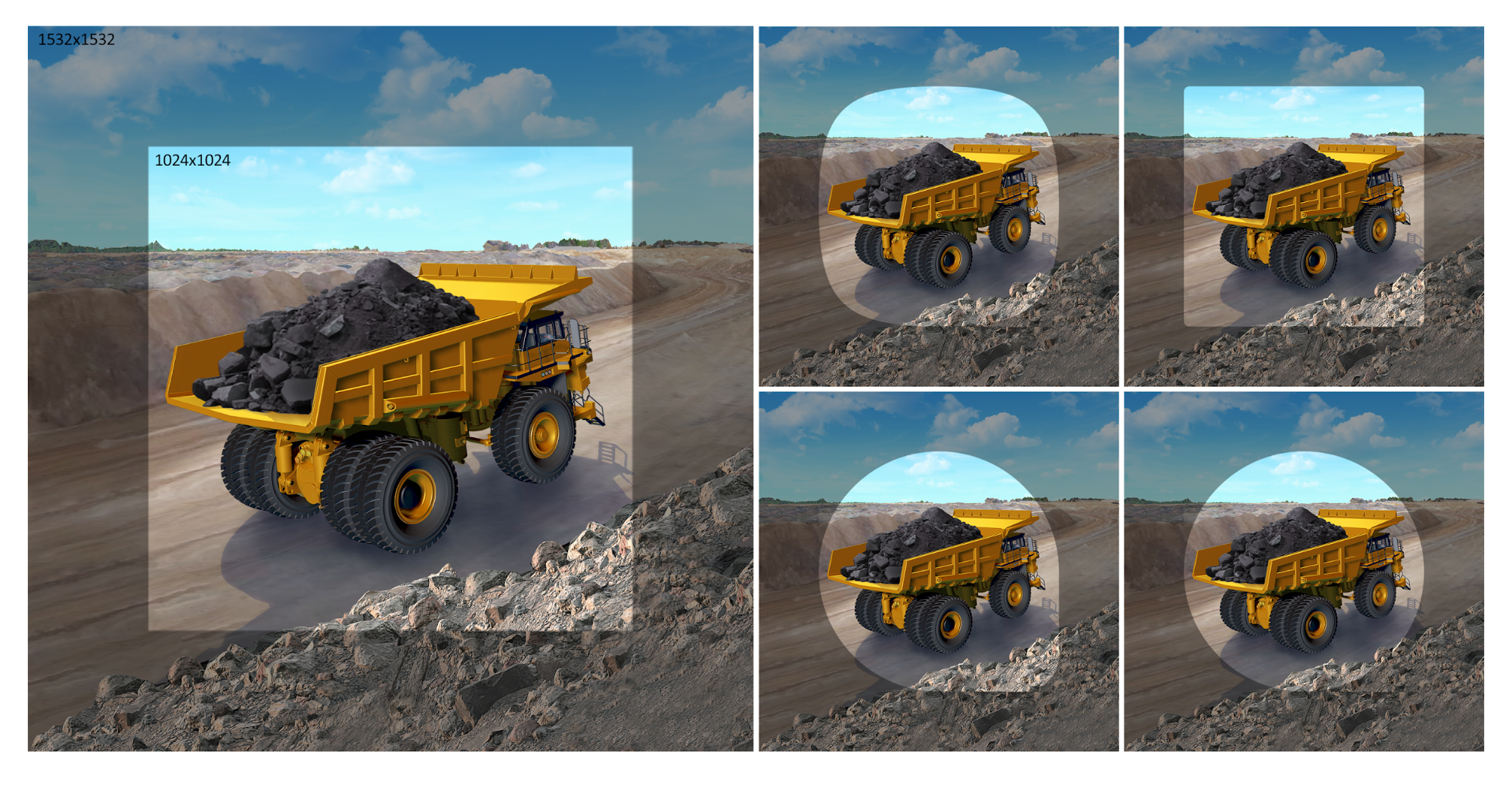
At the same time, it is very important in the process of creating an icon to immediately see what will happen in the end, and not to load intermediate results indefinitely. But it is in our power to manually prepare test previews, which allow us to answer all the questions mentioned above.

This preview contains the main sizes of icons on different platforms

Options on different backgrounds
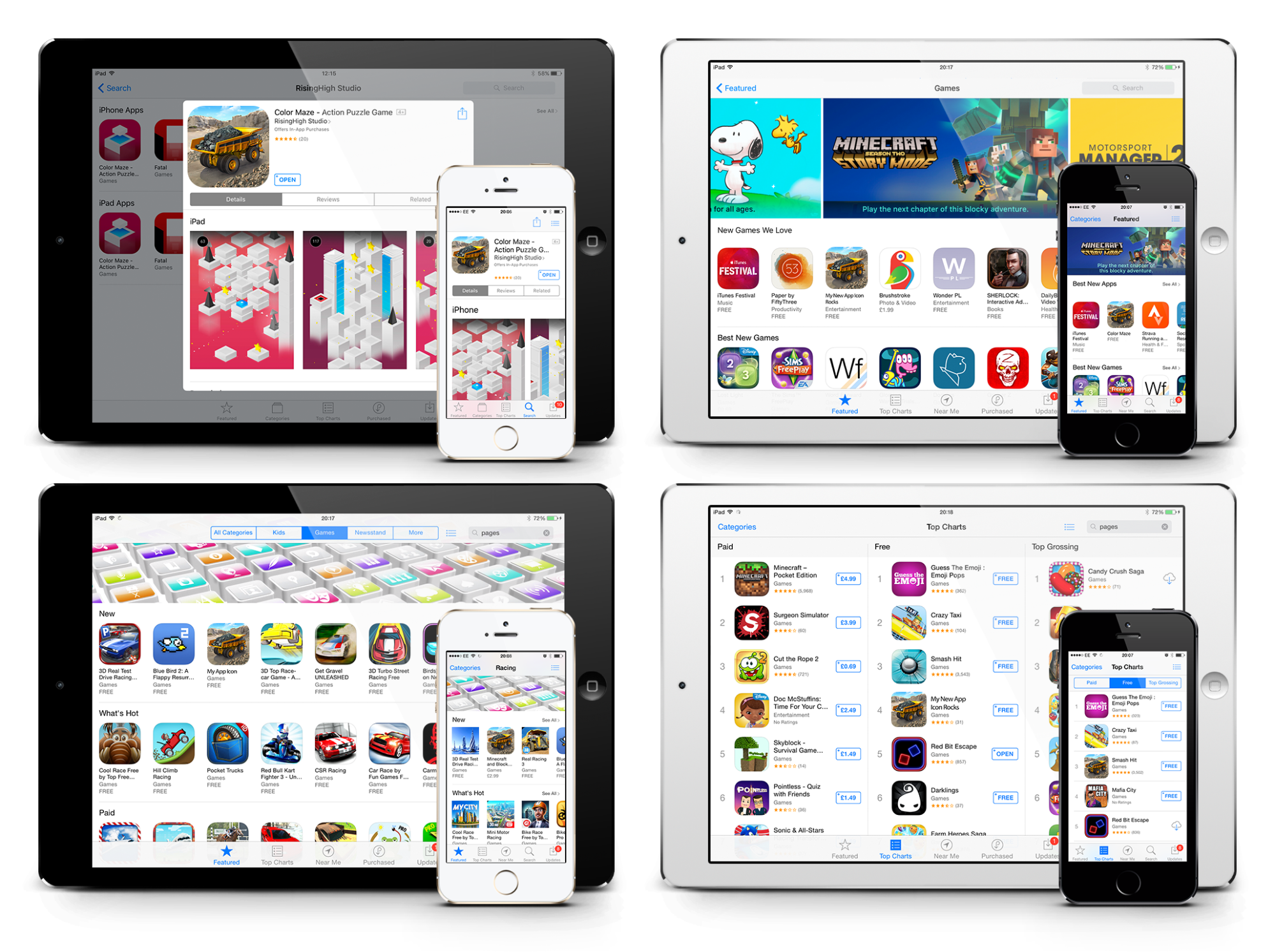
Options on the pages of the store
Using this template, it is necessary to check changes to the icon at all stages of its creation (not only at the final stage).
***
I hope this article was useful for you. Thank you for your attention and good luck in creating your icons, these little worlds in a square!