Case study: how Belka Games successfully grew competencies within art and UI departments with minimal effort
Growing competencies within a team is a challenging issue, often seen as costly and not easy to approach. However, Anton Danko, the lead artist of Solitaire Cruise project at Belka Games, shares his successful experience in this matter.

Anton Danko
Our UI specialists are great at user flow and shaping UX features, but not so immersed in the artistic components of an interface. And artists may struggle to understand UX and UI. This is normal — each specialty has its own specifics and background. But we realized that this could be a great point of growth for us. After all, when building good visuals it’s important not only to design the UX but also to arrange color and composition accents to convey texture and display effects that will attract the players and allow them to immerse themselves in the game’s world.
To expand the competencies of the artists and the UI team, we’ve introduced regular art-meets within the Solitaire Cruise project. In 4 months we’ve had lectures on color, materials, perspective, and more. As a result, in a relatively short time, the teams began to draw better and more eye-catching art and interfaces.
Below, we’ll discuss how we organized the training and what results we got. This article will come in handy if you’re a lead and have already thought about helping your team grow without disrupting your workflow. And if you yourself are an interface designer and want to move into game development, you might find new points of growth. And, perhaps, the outlined training program will be useful for game designers as well — because they, like customers, need to describe their vision and accept work from artists and UI specialists.
At Belka Games, we value mentoring. We don’t impose training or give developmental feedback (we’ll write about this in the next article). We’re lucky to have colleagues — both UI specialists and artists themselves — who are looking for opportunities to expand their competencies. The only thing left for us to do is to help by presenting the required knowledge in such a way that it fits in well with the existing base and can immediately be applied in practice.
How to look for growth points
Any optional activity should be of value for the employee, first and foremost. We help team members develop, but we don’t impose training. So I started with what requests the employees themselves had, what topics they wanted to improve upon. Every few months I do a survey in the art and UI team and ask: “What area within your specialty would you like most to improve your knowledge of?”
Then I compare the results with my observations and with the areas of growth which I see in the final works. If the questions match, it’s a perfect scenario. I take the topic and bring it to the team. If not, it’s no problem. I highlight the topic and break down a couple of cases.
Then the list of questions is prioritized. You can poll the team for this, but after looking at the list it’s (more often than not) obvious where to start.
We clearly matched on the following topics:
- Environment concept
- Perspective
- Rendering materials
- Light and shadows
- Rapid conceptualization
- Work on character emotions
We didn’t limit ourselves to these topics, however, but went further:
- Color
- Stylistics in Games
- Tasteful UI
- UX basics
- The difficulties of working with Photoshop
At first, all the attention was directed to UI-artists — materials, light and shadows, composition. This was so as to allow them to make better concepts and visuals for unique features and promotions. Later, we delved into more artist-specific topics: conceptualization, tools, character creation.
There were different ways to go from here:
- Independently prepare a report on the topics.
- Involve subspecialists.
- Delegate lecture preparation to the team.
I chose the following option: any willing artist could prepare a lecture on the desired topic. Thus, I killed several birds with one stone:
- The team got the lesson they needed.
- The artist who prepared the lecture gained public speaking experience. In addition, sooner or later most skilled professionals have a desire to pass on their knowledge, and this is a great way to leverage their teaching potential.
- In preparation for the lectures, everyone was already improving their skills.
Yes, Zoom is no match for the White Nights, DevGamm, Games Gathering format. But it is great to be able to start small, in a calm and friendly atmosphere. It’s enough to try and perform a task in a casual atmosphere, among your own people. If you like it, you can move from the department level to the company, and then there are some excellent prospects for representing the company at international conferences. Of course, not everyone needs to do this, but I believe that this gives those with ambitions the opportunity to realize their potential.
Another question is how to motivate artists to write lectures.
My method is that everyone chooses whichever theme they like the most. For some it might be a familiar topic, while others chose to challenge themselves by taking on the one they didn’t feel confident about. Those who weren’t eager were just attentive listeners. However, there weren’t many people like that in our team — everyone wanted to share their knowledge.
Which format to use
Quite a lot of useful material is dry and boring. In some places, it remains unclear how to put the advice into practice and verify what’s been learned. We wanted to make our lectures the best they could be, so I set three requirements for the lessons based on experience:
- The lecture should last no more than one hour. After all, we conduct them during the working day, and we need to leave energy and time for project tasks. I also didn’t want to overload people with information.
- Presentations should be easy to understand, the material should be accessible.
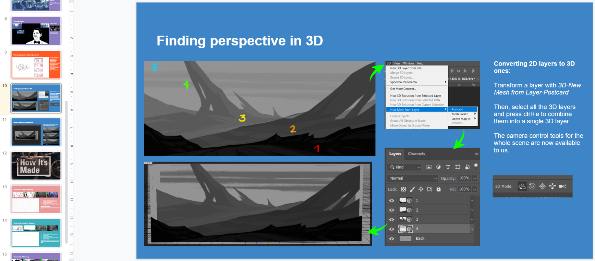
- The material of the lecture should be structured to be later used as a checklist guide.
As a result, we arrived at a presentation with illustrative examples and a short Q&A session at the end. As a rule, we always kept it under an hour. The presentation could be used as an outline. Extra bonus: when giving feedback, leads can now simply leave a link to the desired material.
It’s also worth noting that the quality of presentations can be greatly improved with a feedback form. We introduced this practice, and it helped make the lectures more effective and useful.
Is homework worth giving?
Some lectures were accompanied by optional homework. We didn’t resort to this method often — not everyone would have the opportunity to practice outside of work hours. But some people were interested in practicing. You may see for yourself — this depends on the workload and your people’s proactivity.
How often do you hold these?
The frequency of these lectures depends on the number of questions your team needs to cover. We started with weekly meetings and after 2–3 months decided to meet biweekly. Right now we’ve paused the lectures because we achieved our objectives and reached the desired quality and knowledge level.
Let’s recap
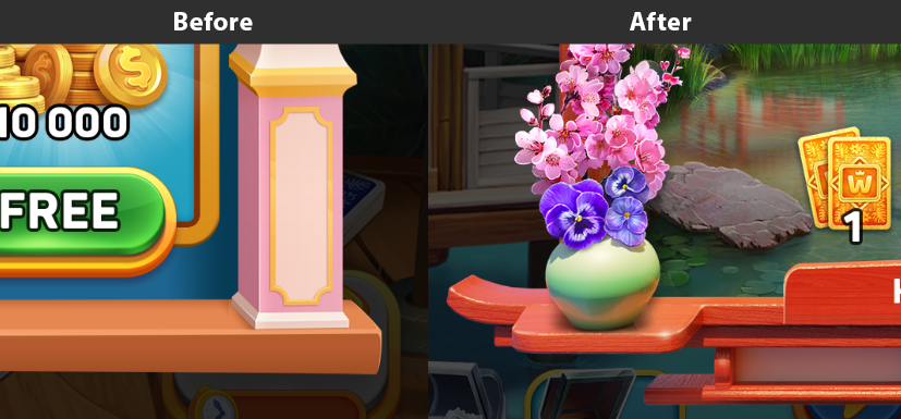
In a relatively short period of time, we were able to raise the graphics quality level in both the UI and art teams.
Result:
- Materials can be distinguished not only by the texture pattern, but also by the nature of form, light reflection, and tone.
- Objects next to one another affect each other (light, shadow, reflections).
- The emotions of the characters have become livelier and more open.
- Art doesn’t “conflict” with interfaces in terms of importance.
- In addition, the team learned important skills. Now they can:
- They can see perspective grids depending on the task at hand. Not just one-point ones.
- They can conceptualize quickly and get more points of control in the process, which has made the outcome more predictable.
Intra-team training offers some not-so-obvious bonuses as well. For example, people in a team get to know each other better, they’re not afraid to advise or share
their own assessment of the visual features.
And we also get a clear result. Here is a couple of examples — the visuals made before and after the lectures:


