Creating a visual style for metroidvania: a case from the Blast Brigade team
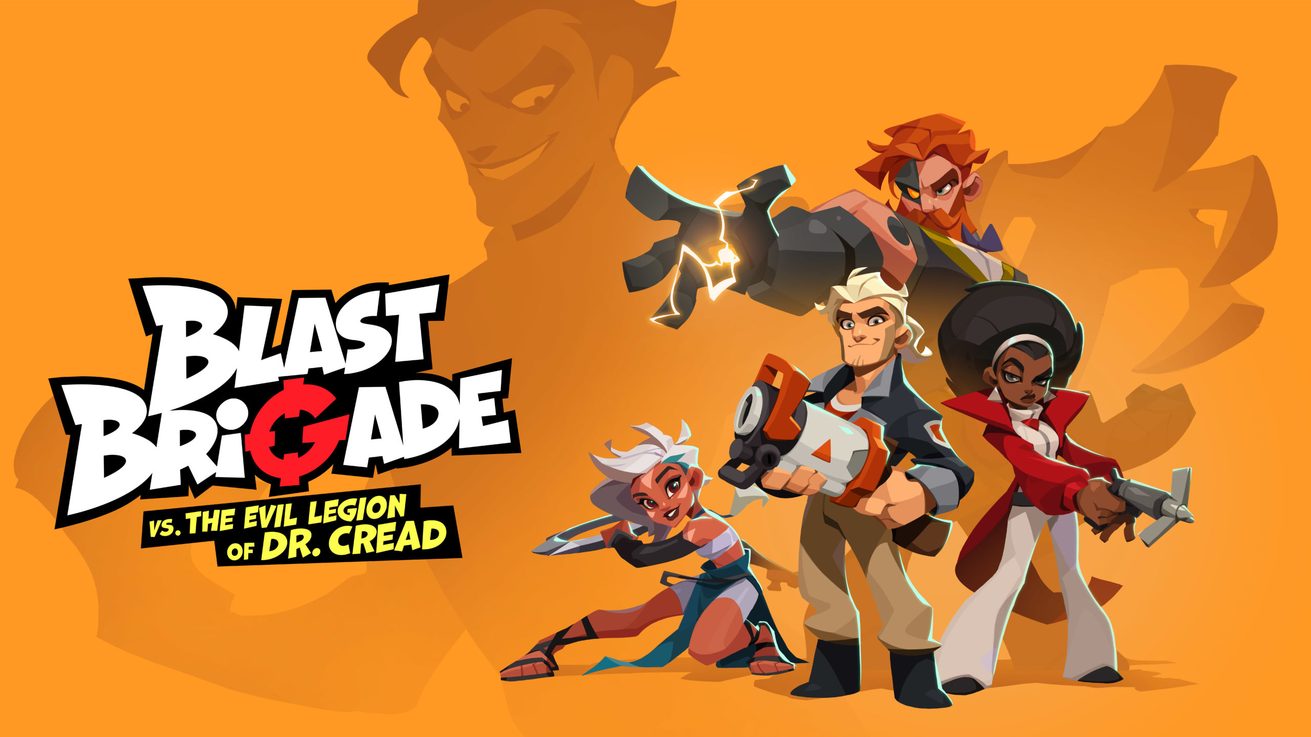
Last May, Allods Team announced Blast Brigade. This is a two-dimensional metroidvania, one of the distinctive features of which is bright cartoon graphics. We asked Yulia Krasheninnikova, the art director of the project, to tell us how the work was carried out on it.
Working on the visual style
I’ll start with the obvious: the visual style of the project inherited a lot from its mobile predecessor Bombastic Brothers and this decision had its reasons. Firstly, the core mechanics of “Bombastic” had its positive aspects and the studio management wanted to further develop this idea. Secondly, the deadlines we had for creating a new product were quite tight and did not particularly allow the art team to conduct a full-fledged study to find a visual solution from scratch.
These two factors, of course, put serious pressure on the development, but in general, the team set to work with great enthusiasm, because the opportunity finally opened up for us to get rid of the free-to-play stigma and start making what are called real games, as well as get rid of some of the technical limitations and at least a little give free rein to imagination and artistic desires.
It all started with this
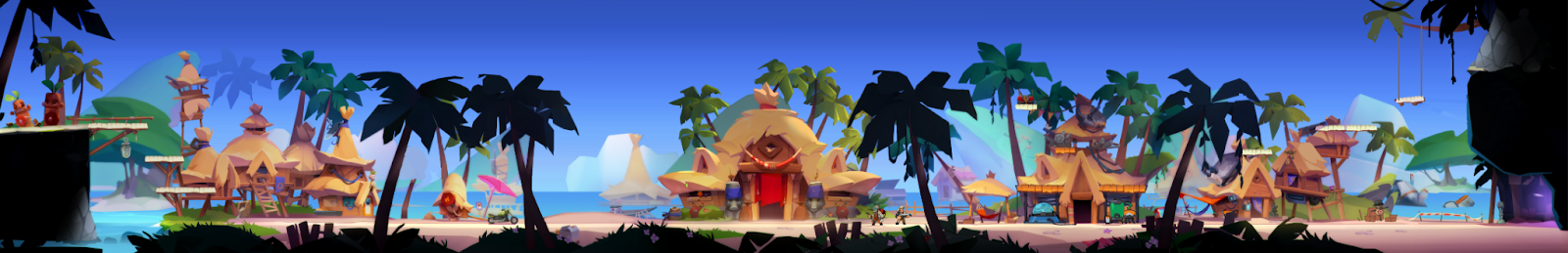
One of the first tasks was to determine what general feeling we want to get from the graphics of the new project, to catch the right atmosphere and understand in which direction we will generally move within the current capabilities. To do this, using the available assets from Bombastic, we quickly collected several fake shots. In them, first of all, we tried to breathe more life into the atmosphere of the game due to more dense content. After receiving the first results and approving them with the management, we turned to a team of programmers to find a technical pipeline that would allow us to implement our plans in the right quality. Since the idea proposed by the programmers subsequently greatly influenced the path along which the stylization of the “Blast” was then directed, I will share some technical details of both projects.
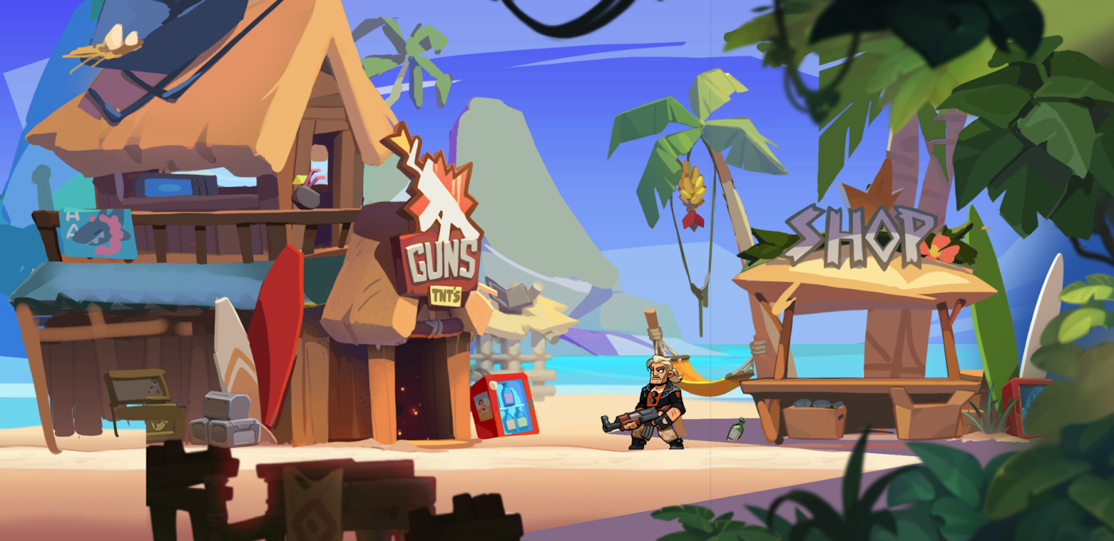
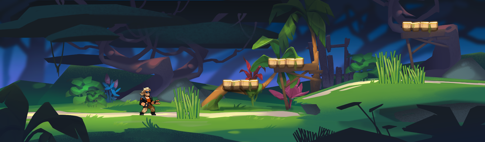
Intermediate iterations of the prototype
If the principle of working with art on a mobile project was quite simple and boiled down to importing individual images into Unity, then the new solution involved transferring the assembly of levels to Blender by using meshes with opaque material and full-fledged textures. The main problem of the old pipeline was the need to maintain transparency on each asset (which had an extremely detrimental effect on the efficiency of using the atlas space), and according to the new scheme, we were given the opportunity not only to fill out atlases more efficiently, but also to use 3D tools, thanks to which there were many more opportunities for editing levels and individual assets.
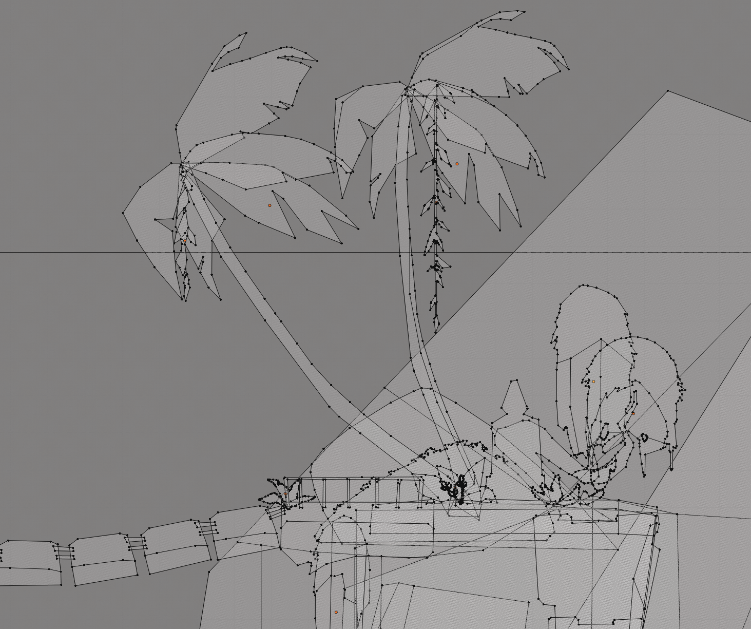
Points inside meshes
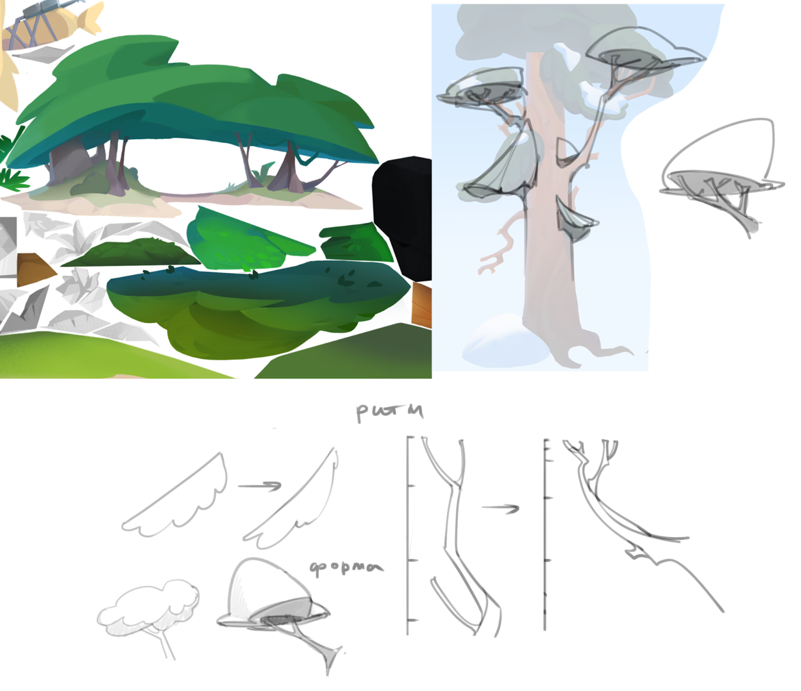
The only limitation in this case was the number of dots inside individual meshes, which became one of the determining factors in choosing the style of the environment: in order to facilitate the art cutting stage and prevent overloading on the vertexes, it was decided to simplify the graphics of the environment in favor of geometric styling, with as clean silhouettes and a minimum of rounded shapes as possible.
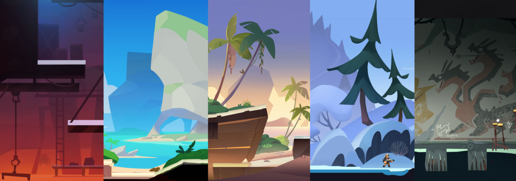
Atmospheric concepts taking into account the new pipeline
After we understood which shapes we would work with, the decision to fill them was also made in the direction of simplification: we abandoned the detailed rendering in favor of working with a spot, gradients, light effects and a small number of texture brushes.

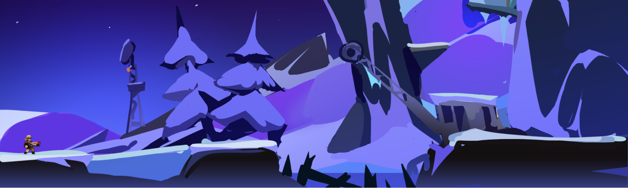
Concepts that became the main one for the first developed biome
Released a few months earlier, the Klaus cartoon only reinforced the belief in the efficiency of this style and became one of the main sources of inspiration for landscapes in Blast Brigade. Also, as references, the team focused on such titles as Samurai Jack, Carmen Sandiego, The Owl House and other works from the world of animation, trying to introduce into the future game as much as possible the atmosphere of 2D cartoons.
If we also talk about references, then at the preliminary stage of development — when choosing a setting — a mudboard with graphics from the games we wanted to focus on was prepared. Considering the backing in the form of Bombastic Brothers, among them, of course, were such titles as Streets of Rage, Broforce, Mercenary Kings and Metal Slug, and the main landmarks from the point of view of the genre for us were Ori, Monster Boy and Hollow Knight.
Styling Tips
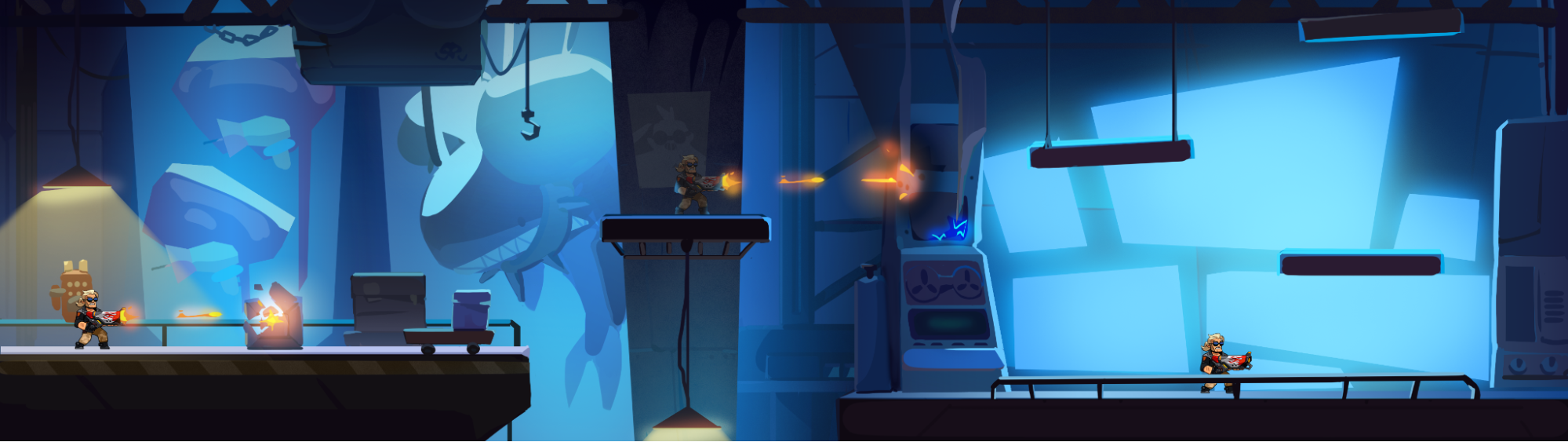
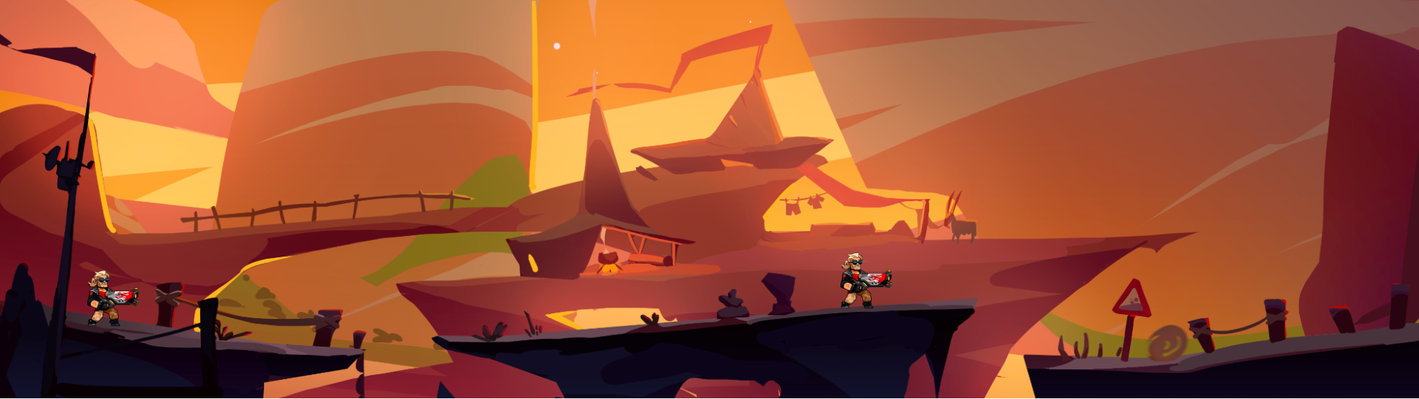
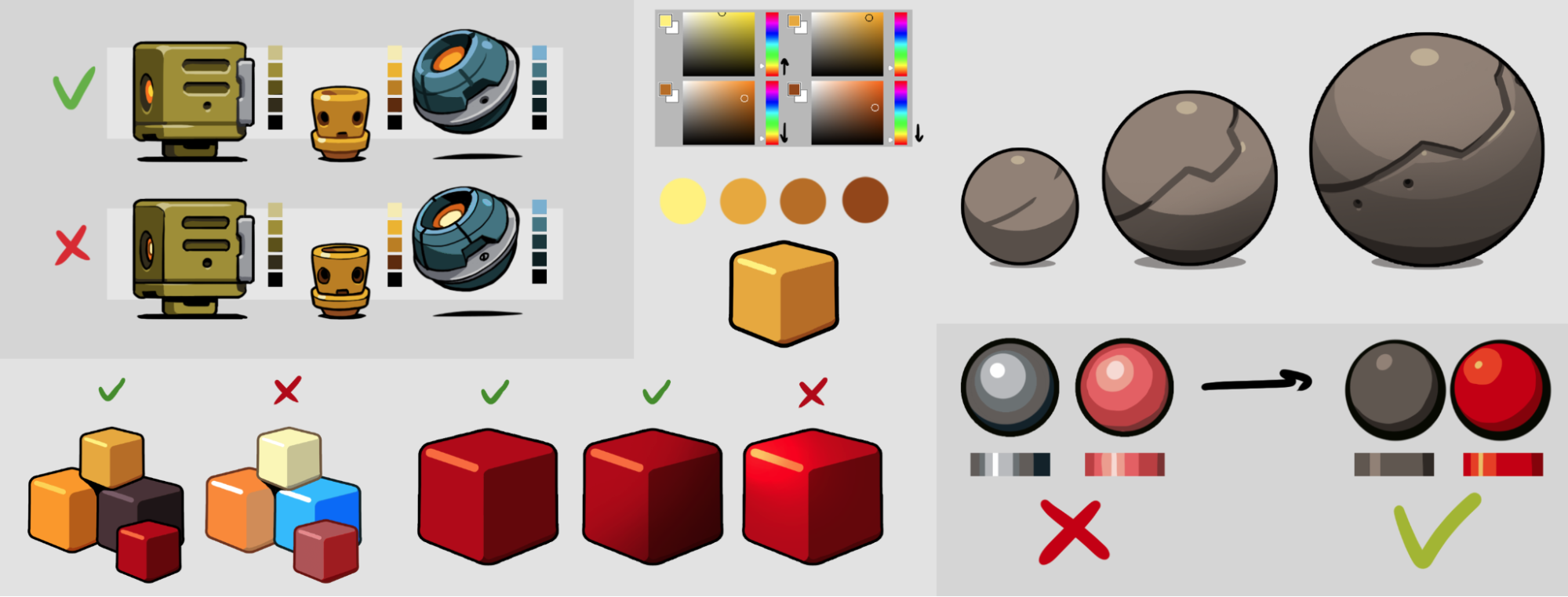
Going deeper into the study of the environment, we tried to use dense, saturated colors to create as “tasty” a picture as possible. At times, due to an old habit developed while working on mobile games, we got too carried away with saturation, which is why we had to return to some levels more than once with color correction edits.
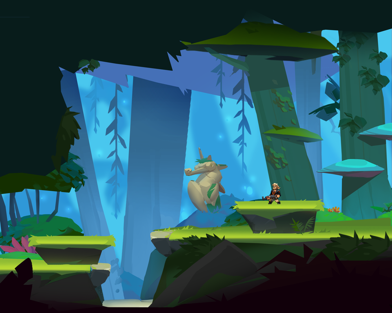
For the rest, when working with the color palette, the team of artists started from the interaction of the environment with light: an important aspect of transmitting the atmosphere was compliance with the principles of heat-cold lighting, aerial perspective, reflected light and contour, as well as attention to tone balance to separate zones that directly affect the gameplay. Regarding the last point, we tried to distribute the tone in such a way that, first of all, the UI, heroes and enemies were clearly visible on the screen, then the game zone and objects for interaction were prioritized, and the rest of the landscape reduced contrast as it moved away from the camera.
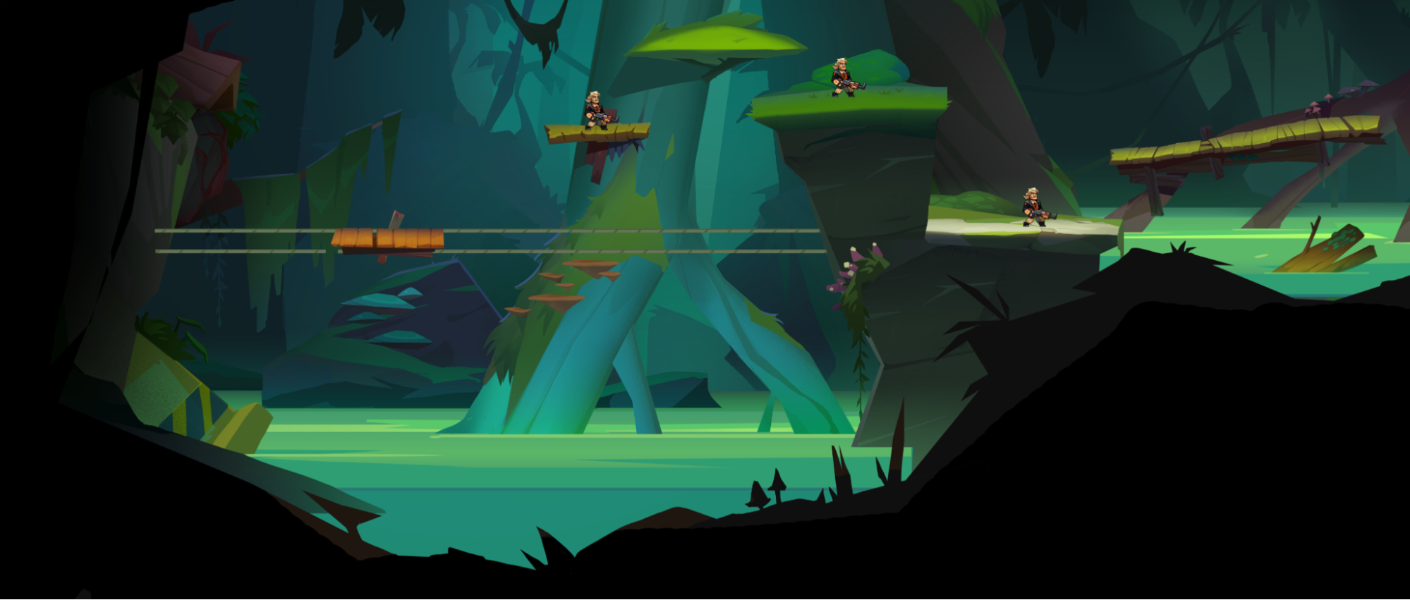
Palettes of different biomes

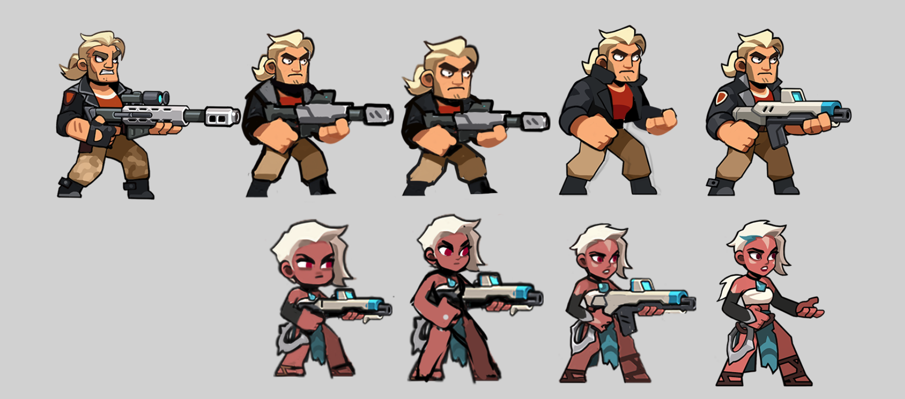
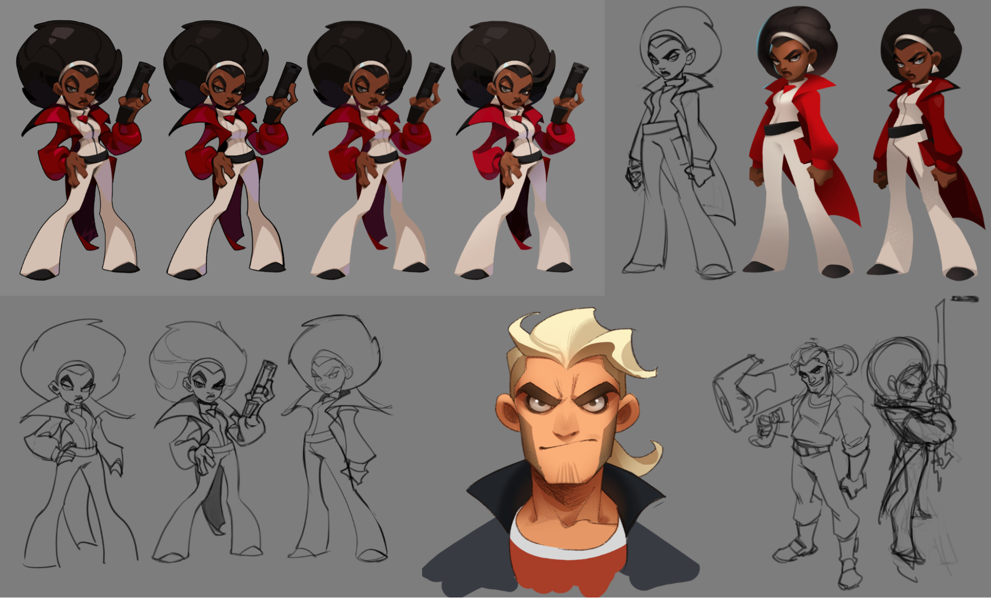
In order not to lose units against the background of a colorful environment, all the characters and monsters were made in a slightly different style: they have a uniform black contour and fill on the principle of cell-shading, a rather limited range in warm tones with shadows of local colors, as well as a clear brightness step between each dimming level. In truth, most of the principles of working with characters migrated from the “Bombastic”, which allowed the use of existing guidelines. The main difference between the new design of units is a slightly more detailed elaboration, slightly elongated proportions and the number of additional assets for various emotional animations.
Guidelines for rendering units
Experiments with proportions and detailing
Working on characters
Each character has his own passport with a general description of his biography, characteristic features and in-game abilities. Before starting work on the design for each hero, NPC, monster or boss, we first collected separate mudboards with references, and also held discussions with the game design team about how the game mechanics embedded in the units should be displayed in their appearance.
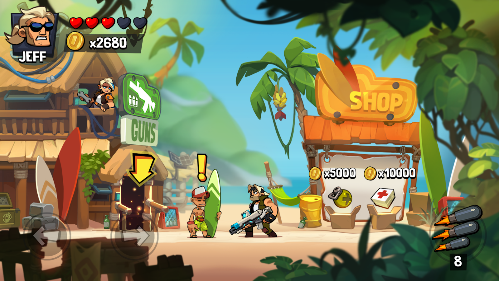
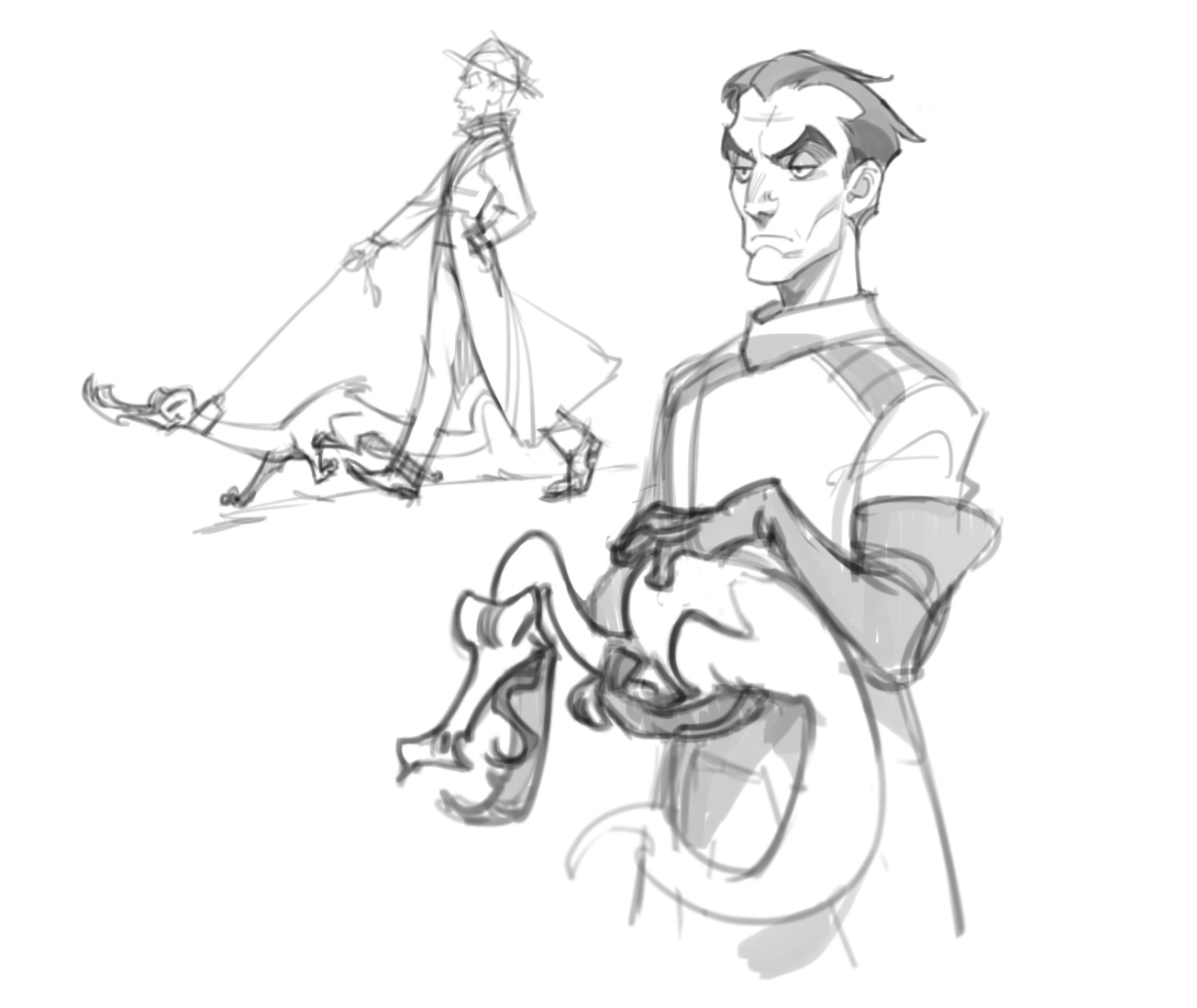
The main character (Jeff) is essentially a young version of himself from the mobile Bombastic Brothers. The idea was to portray him as a younger, less worn-out, but still the same stupid fan of arranging “fireworks”.
The first version of his design for Blast Brigade looked quite aggressive and brutal, but later we decided to change his appearance towards a more charismatic and stylish guy who is able to express a much richer range of emotions than “I’m angry and brutal, that’s where my personality ends.”
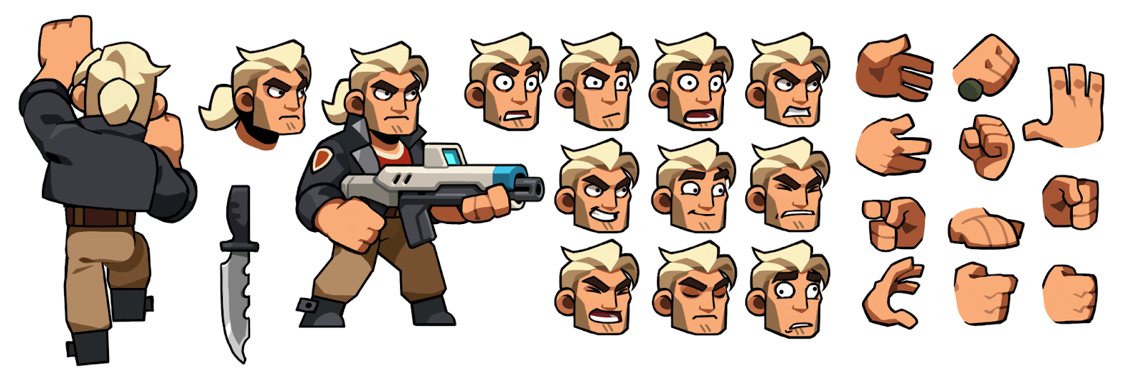
Jeff
The main idea of the art team was to convey the straightforward and purposeful character of the hero, as well as at the same time to show that he is not burdened with great intelligence. Subsequently, this opened up more opportunities for the introduction of comedic moments in dialogues and even partially influenced some storylines.
Shura, too, was not laid out from the very beginning as a KGB employee. At the first stages of its development, the artists did not yet know what changes it would have to go through. However, when the main design was approved and already handed over to the animators, the screenwriters informed the art department of the news about its origin.
We have been racking our brains for a long time how to disguise Shura so that it could be said with certainty that she is a Soviet spy. We tried a lot of different variants of uniforms and color schemes, but in the end we came to the conclusion that a spy is a spy — it should not be easy to determine by his appearance whether he belongs to the faction for which he works. Therefore, we stopped at the original design, changing only the color of the coat from yellow to red.
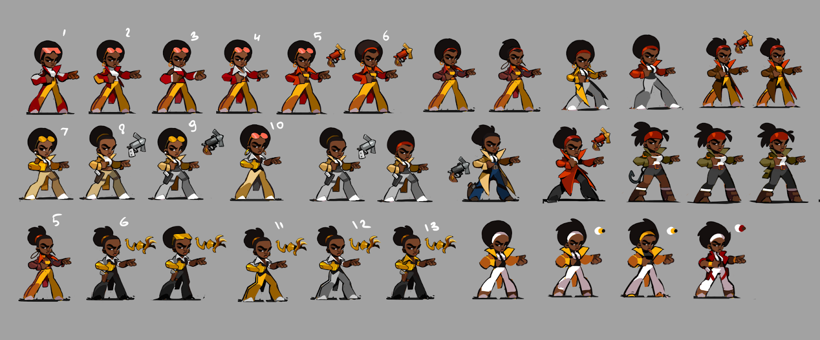
The search for the image of Shura even before it became known that she was from the KGB
Vortex as a character in fact also moved from Bombastic Brothers. In the mobile version, she was the last character fully ready for release, but since work on the project was stopped, she never got into the game. The design at that time was quite fresh and it was frankly a pity to throw it away, so she was taken as one of the prototypes for the Blast Brigade.
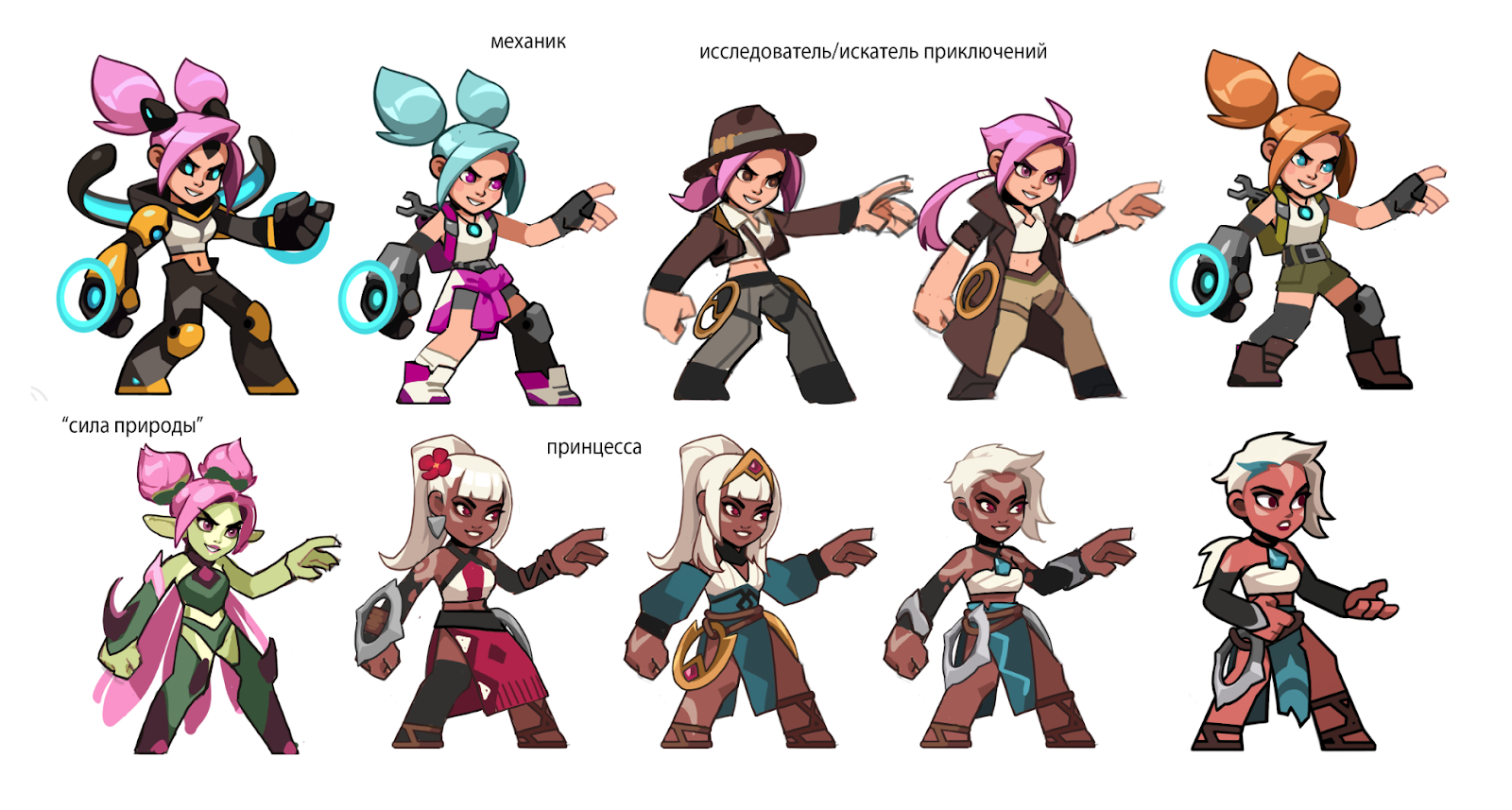 The Vortex Path
However, the futuristic design did not fit well into the new setting, and then, by the will of the screenwriter, Vortex became an indigenous inhabitant of the island at all, which led to drastic changes in her appearance. Her young age, energetic disposition and shakram as a weapon remained unchanged.
As for Galahad, his roots also go back to the mobile game, but from the point of view of the visual, only a large complexion of the hero remained from his original prototype. For the rest, his design was created from scratch and, as in the case of Shura, was intended to combine extremely distant things from each other: a Scotsman, a spy and a cyborg man.
In general, the more elaborate ENT the heroes had by the time the concepts were ordered from the art team, the more tricky the tasks turned out to be. To be honest, the art department initially had the opinion that there were too many “attractions” embedded in the character design and it would be impossible to create an adequate-looking character based on it. Nevertheless, after a couple of dozen iterations, the right balance of all aspects of its design was still found. That’s how the cybernized gentleman in the kilt saw the light.
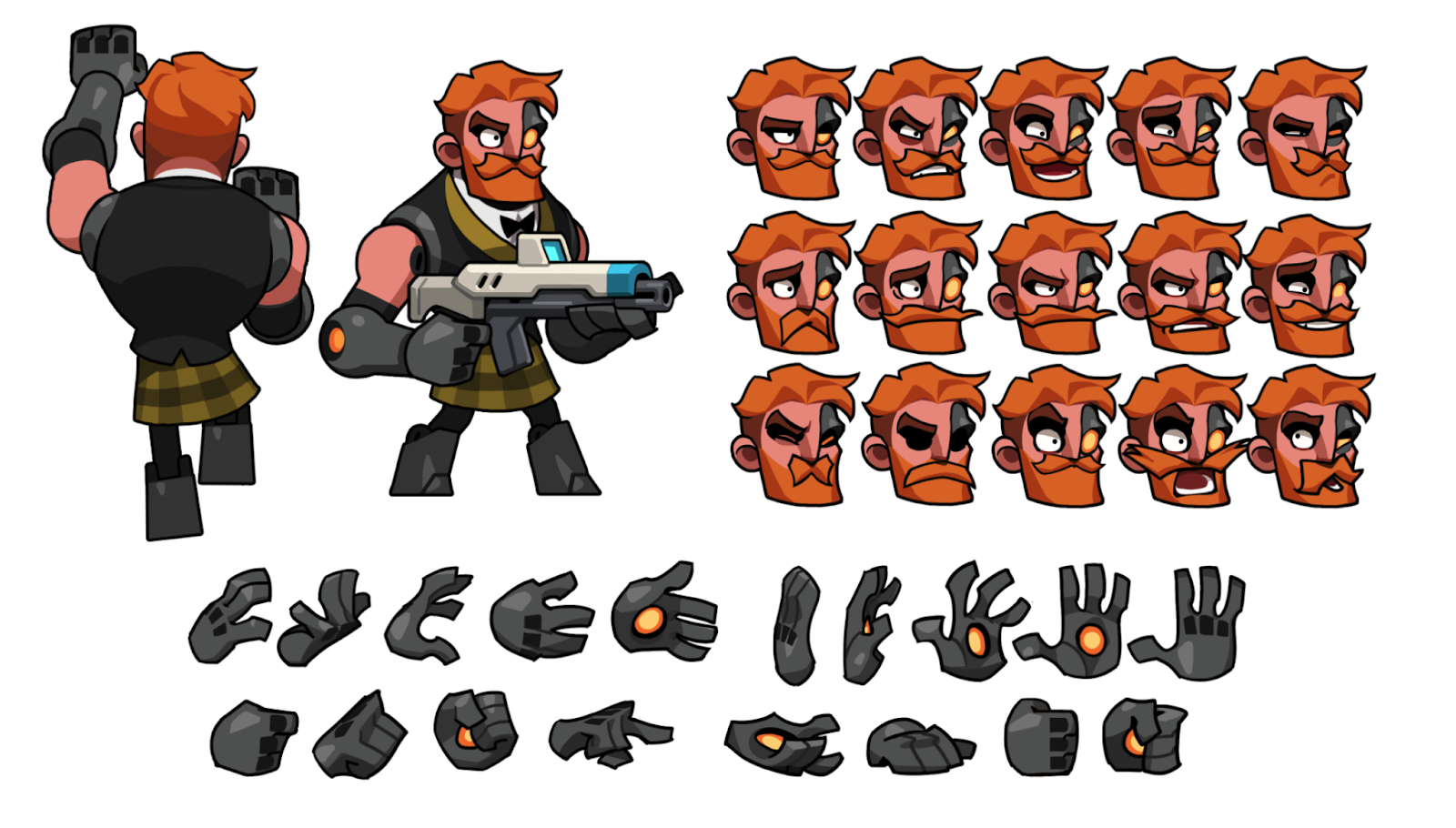
Galahad
Separately, I note that there was a fairly clear point in the terms of reference that Galahad should be the biggest hero in the lineup, but at the same time remain the same size as everyone else. It sounds absurd from the outside, but due to certain game mechanics, the visual of all the characters should fit into a certain “capsule” (aka hitbox). The task turned out to be feasible: Galahad received extremely broad shoulders, arms and chest, and greatly reduced legs allowed him to fit into the required size and at the same time emphasize the scope of his torso even more.
We also have a villain in the game. Here is one of his first concepts
Working on the interface
The interface design proved to be a serious challenge for the team. The fact is that before that we only worked with mobile projects. The lack of experience in creating UI/UX for PC and consoles greatly affected the amount of time we had to spend on intermediate iterations.
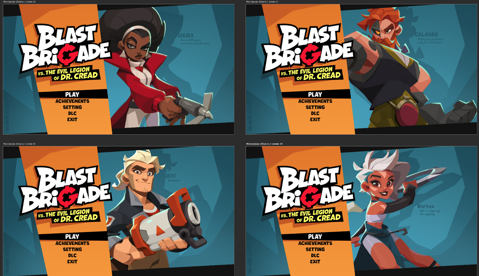
Home Screen Concepts
A lot of options were tested, redone and thrown out before we were able to create a concept that would adequately fulfill its function from the UX side, looked aesthetically pleasing, and also had elements working for additional immersion of the player into the atmosphere of the game
In general, all the options were similar to each other, since in the process of searching for a design, the number of functions and their main location practically did not change, but the devil, as they say, is in the details.
For example, the main color scheme was originally planned around a dense orange hue (as in the promo), but at some point we realized that the player’s eyes might get tired of such an amount of intense color, given that the art in the game itself is already quite saturated. So the menus that can be viewed in between gameplay (inventory, map, modules, and so on), it was decided to do in a calmer cold range, and leave the theme of saturated orange / yellow only as an accent for the selected elements.
Intermediate concepts of the lototype
A special challenge was to make the interface not only utilitarian tools for accessing various resources and information, but also to make sure that the space of various menus supports the overall atmosphere of the game, not allowing the player to fall out of the story about spy adventures. I won’t say that we managed to achieve this 100%, but we had to do a lot of research, discussions and layouts.
Difficulties
During the development, it also happened that practical ready-made assets had to be put aside and start looking for a design anew, since the previously selected visual solutions either did not meet any of the technical requirements, or during the discussions the team had a much more interesting idea.
For example, Jeff and Vortex went through a complete redesign, which I wrote about just above. Their original versions did not accurately convey the character of the characters, and the visual component fell somewhat short of the level we were aiming for.
Such global alterations affected several characters, units, as well as the assembly of a decent number of levels and were mainly carried out under the motto “actually, we can do better and now we even know how.”
Discarded concepts for key art
This is especially true for the levels, since over the months of work on the project, the team of technical artists has accumulated a rather massive amount of expertise. At a certain stage, the quality of the new levels turned out to be noticeably higher than those that were collected in the first months. Because of this, many old rooms have undergone major changes, not only from the side of art, but also in terms of geometry, too.
***
I hope you were interested. If you have any questions, be sure to leave them in the comments, I will be happy to answer.