Trends in visual optimization of mobile games — ASOdesk research
ASOdesk has published a study on the design of game pages in the App Store and Google Play. In it, she told what techniques ASO marketers most often resort to when working on icons and screenshots.

Maria Chernoplekova — ASOdesk
ASOdesk researched 100 free games from the top App Store and Google Play in the USA. In this article, we have collected statistics on the design of pages of popular gaming applications.
Icon design
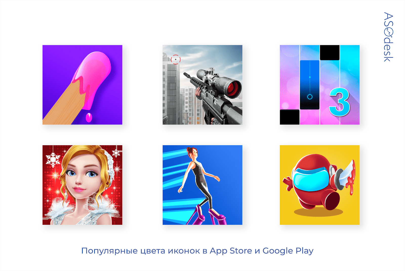
If application icons are designed minimally, then game icons, on the contrary, attract users with bright colors, graphics and characters.
Parameters for evaluating the design of icons:
- the main color of the icon;
- image on the icon;
- the presence of an inscription.
Icon color
It is impossible to highlight certain background colors and the main image on the icon due to the large abundance of design options. But we have identified the predominant colors that occur most often.
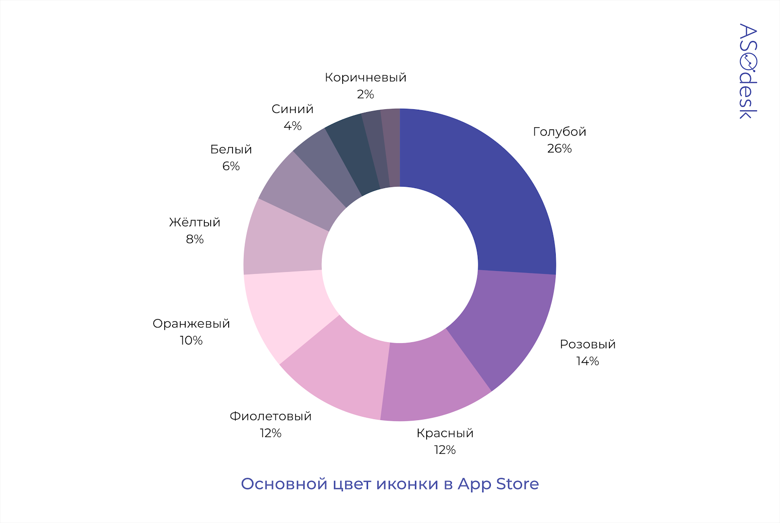
In the App Store, the most popular color in the design of icons is blue, it is used by 26% of publishers. Slightly more than a third of the icons are decorated in variations of red color: from pink to orange. 12% of publishers use purple.
In Google Play, the blue color on the icons is used even more often — in 34% of applications. Red shades are not so common, publishers prefer to use darker colors: purple (14%), black (10%), blue (8%). 10% of icons are decorated in yellow.
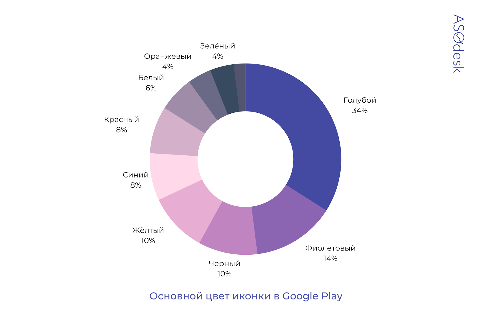
Note that the green, brown and white colors on the icons are rare, which means that with the help of them you can become more noticeable in the search results.
Image on the icon

We analyzed the images on the icons to find out how many publishers use logos, characters or graphics.
Only well-known game publishers can afford to use the logo on the icon. In the App Store, there are logos on only 18% of icons. 48% of publishers add a graphic image of the game.

In Google Play, publishers of top games do not add logos to icons at all. In Google Play, icons with characters are more popular than in the App Store: 76% of publishers use them.
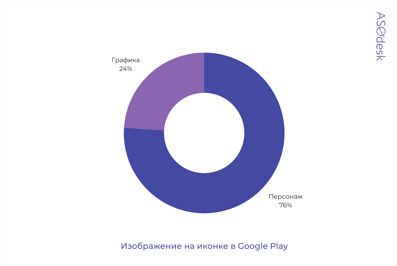
More often, the icon has a graphical image of the game or character interface. Compared to the results of the last study, the frequency of using characters increased by 10% in the App Store and by 28.5% in Google Play.
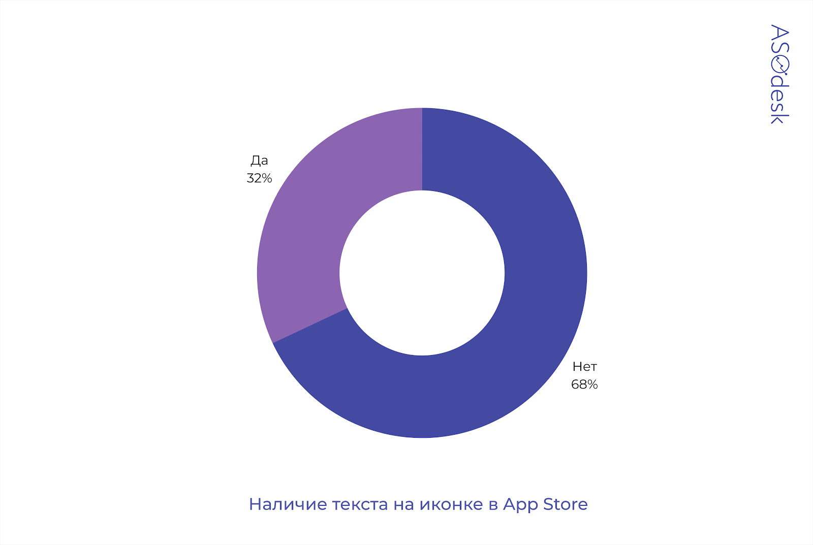
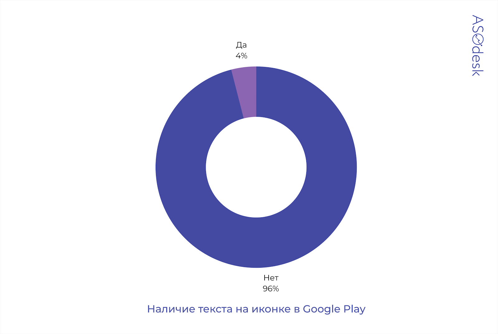
The presence of text
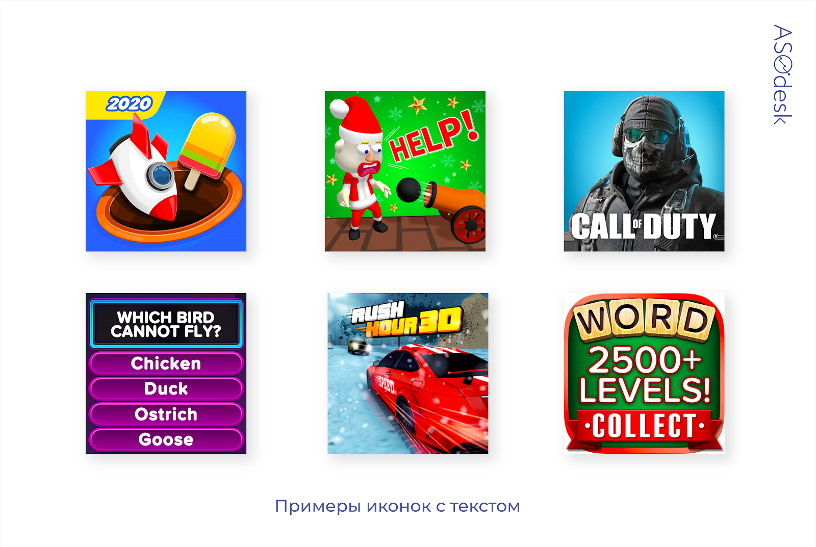
You can often find the names of games on the icons. Numbers indicate part of the name or year. There is also an additional text that should interest the user. For example, the inscription “Help” motivates you to download the game and help the hero.
In the App Store, a third of developers put text on the icon.
Whereas in Google Play, inscriptions can be found only on 4% of icons.
Making screenshots
The vast majority of publishers prefer to leave screenshots without any processing and simply publish images of the gameplay. This is how games differ from applications, whose developers often do graphic processing.
Parameters for evaluating the design of screenshots:
- background color or interface presence;
- the presence and color of the text;
- availability of the device;
- orientation and composition;
- the number of screenshots.
Background color of screenshots
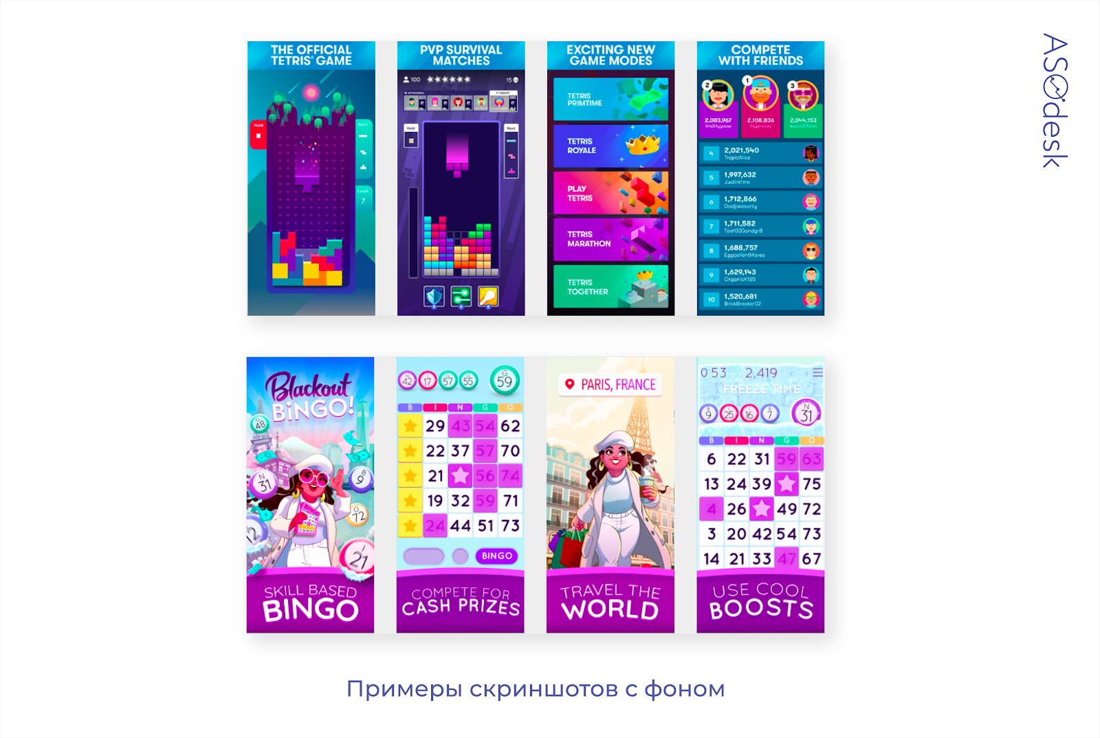
Compared to applications, the background in the screenshots of games occupies a small part of the screen and is more often used as a background for text, which is superimposed on the screenshot of the interface.
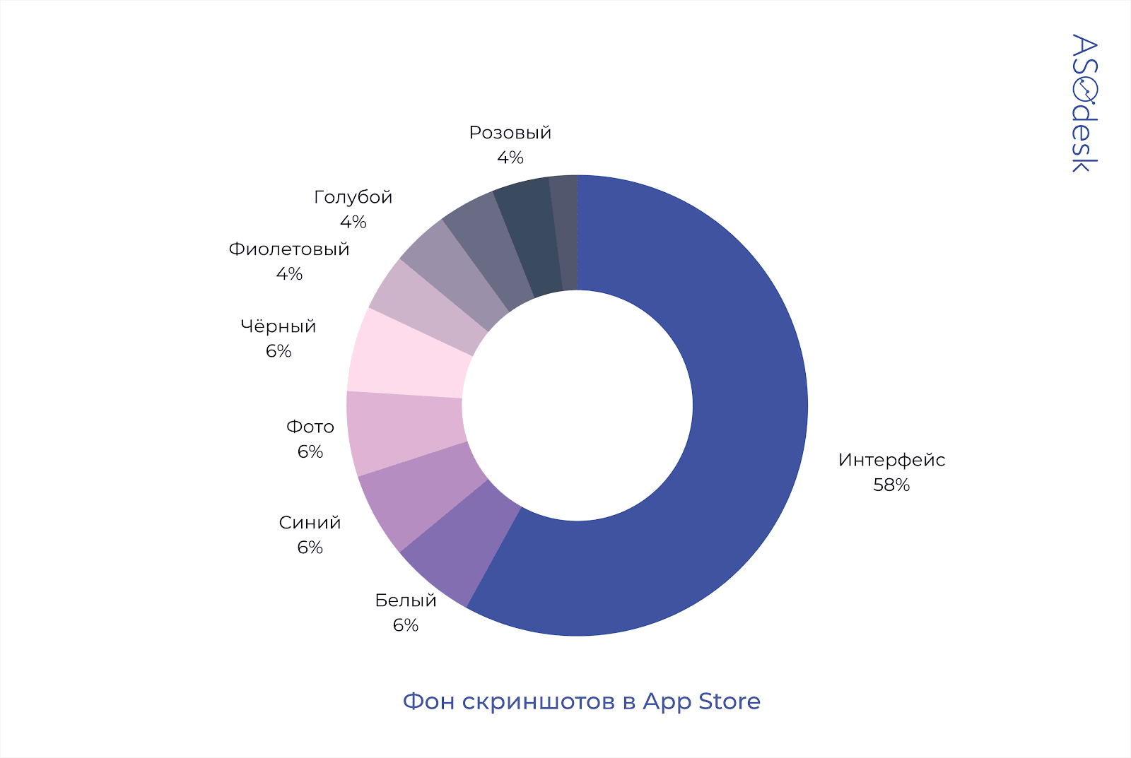
In the App Store, 58% of developers put the interface on screenshots, and 36% add color backgrounds. Blue and white colors are used by app publishers most often.
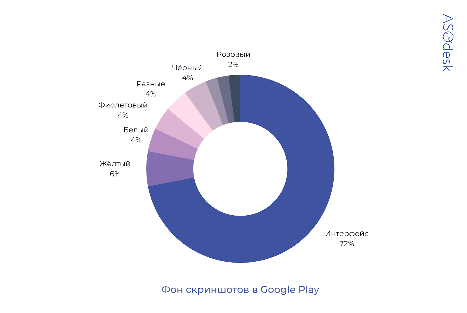
Only 28% of developers on Google Play use color as a background, the remaining 72% add an interface to the screenshot. 6% of publishers use yellow, purple and white colors. White, black and purple background colors are the most popular.
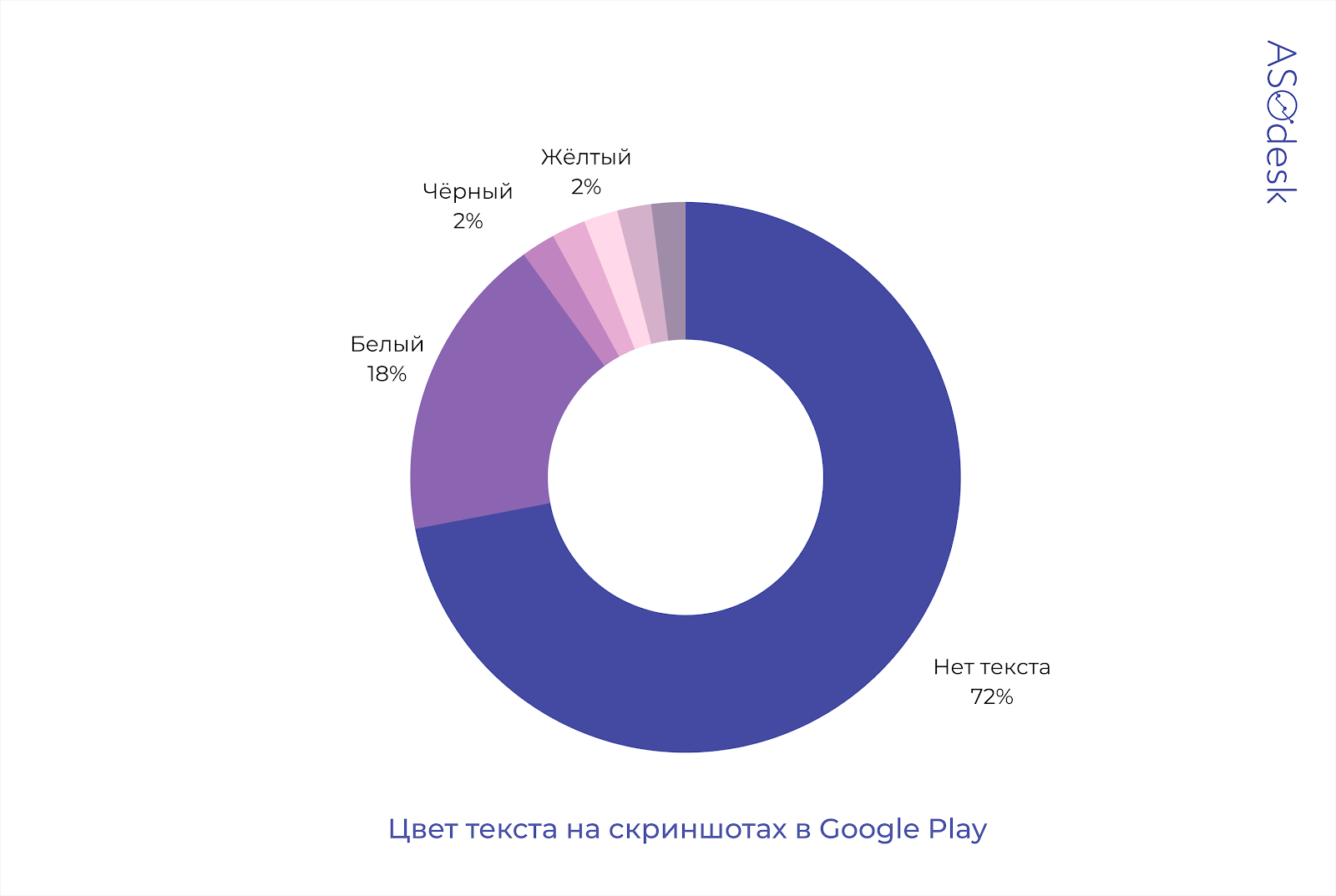
Text color
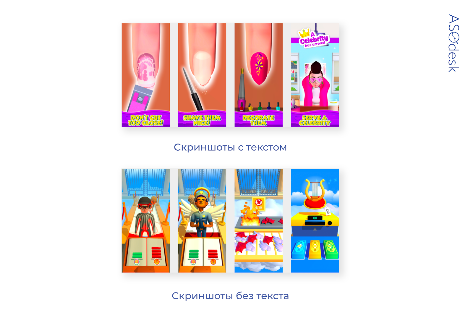
Publishers don’t often add text to screenshots. If there is an inscription, then it is most often white and placed on a bright contrasting background. You can also find yellow and black text.

Availability of the device

Unlike applications, game developers are much less likely to place screenshots of the device. Some game publishers use barely noticeable outlines of a smartphone (as in the picture above). This allows you to show the interface on the device and at the same time not go beyond the design in the style of the game.
82% of app publishers add smartphones to screenshots, while only 6% of game developers do it.

Orientation and composition of screenshots

Developers prefer to use a vertical orientation, which allows you to show three images in the search results at once and convey more information to the user. Horizontal screenshots are more often used for games that host videos on their pages.
Only 20% of app publishers in the App Store and Google Play use horizontal orientation.

Game publishers rarely use panoramic composition.
Many developers add a panoramic composition only in the first two pictures.

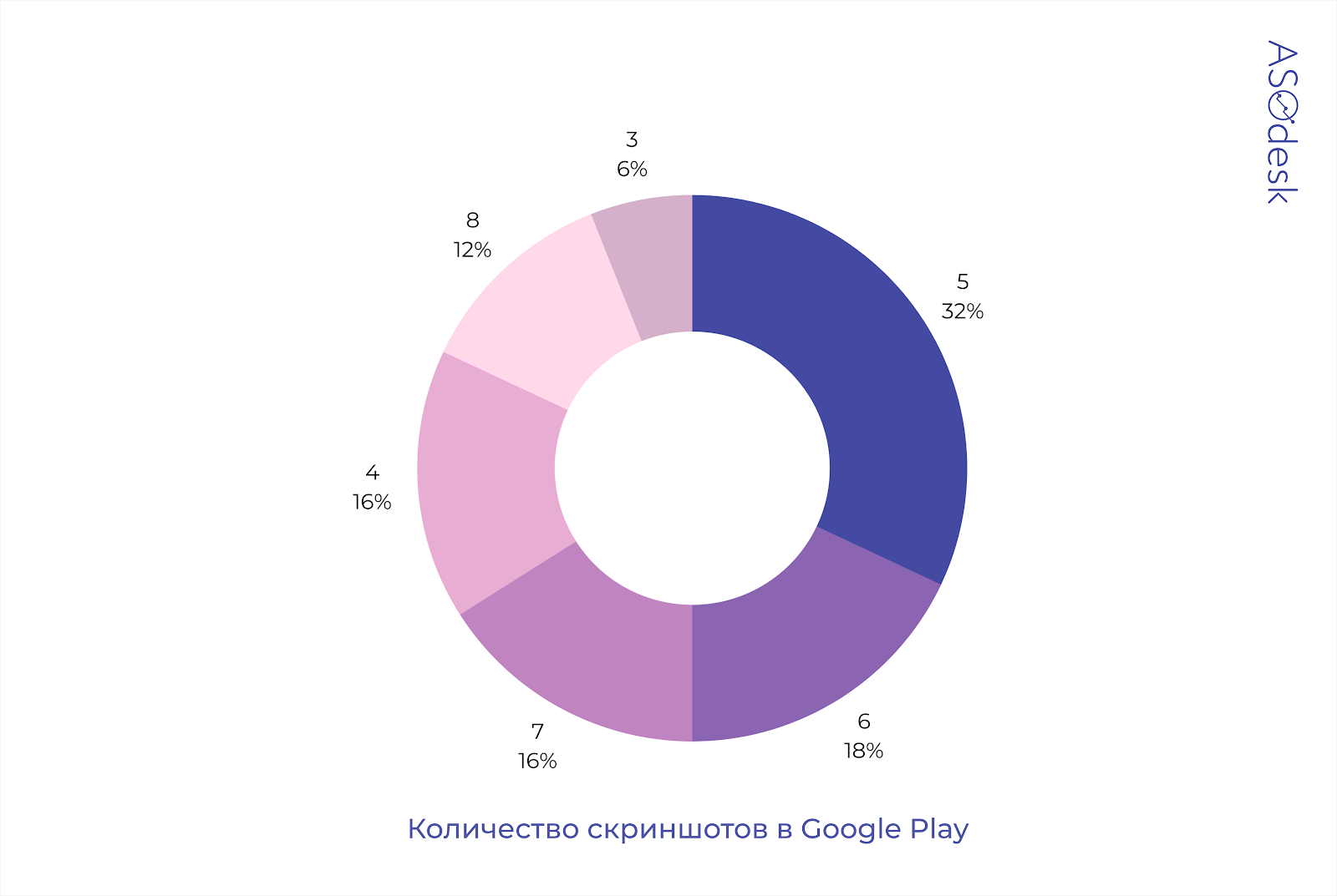
Number of screenshots
Although 10 screenshots can be published in the App Store, and 8 in Google Play, many developers do not use the full potential to attract users. Usually publishers publish 4-6 images on the game page.
In the App Store, only 8% of developers use the maximum number of screenshots.

Only 12% of game publishers post 8 screenshots on Google Play.
Video design
Unlike app publishers, game developers use video more actively. Bright and dynamic gameplay cannot be conveyed with screenshots, and videos do an excellent job with this task. The main goal of publishers is not to show all the useful functions of the application, but to interest the user in the setting, graphics quality, action and good physics of the game.
Video Design Evaluation Parameters:
- availability and quantity of videos;
- sound, text and video format.
Availability and quantity of videos
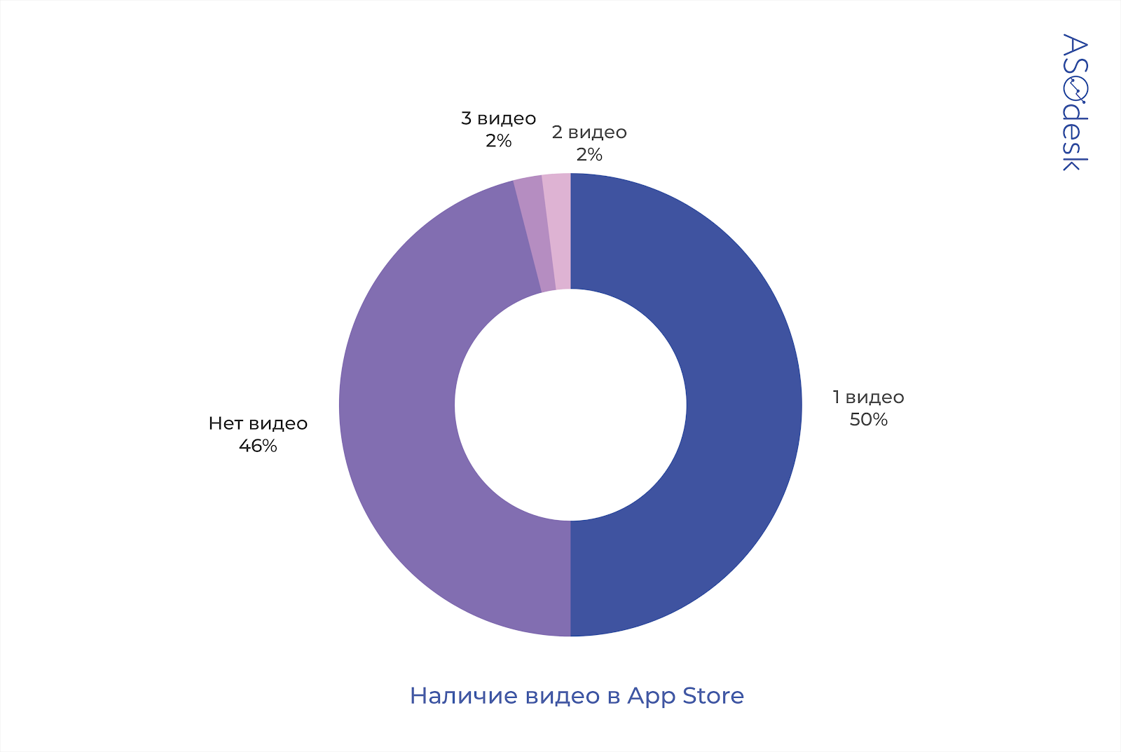
More than half of App Store developers add videos. You can add 2-3 videos to the App Store, but only 4% of publishers do this.
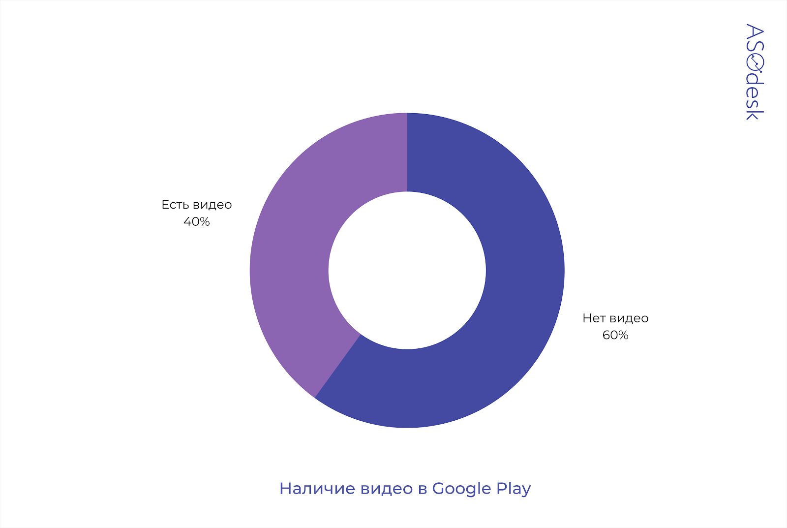
40% of game publishers add videos to Google Play.
Sound, text and video format
Almost all videos are accompanied by sound. Most often you can hear dynamic music or sounds that are present in the gameplay.
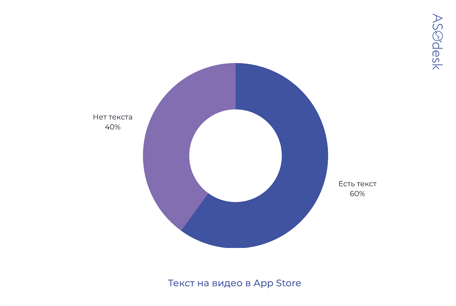
60% of game developers in the App Store add text accompaniment to the video. The text calls for installing the application and describes the main actions that the user performs in the game.
In Google Play, text is used in only 10% of gaming applications. As a rule, developers simply show the gameplay without accompanying it with comments.

Half of the developers on Google Play show not just the interface of the application, but shoot mini-movies.
For example, the video of the Call of Duty application is not an ordinary shooting of the gameplay, but a full—fledged commercial in which the effects are used: approximation, distance and rapid frame change. The clip is complemented by dynamic music and descriptions of the game’s features, which are reflected in the text.
Now let’s move on to the conclusions.
How is it customary to design game pages
- Publishers add bright, colored icons, mostly blue.
- There is a character or graphics of the game on the icons.
- Screenshots illustrate the interface and are not processed additionally. Most publishers don’t use backgrounds in screenshots.
- The vertical orientation of screenshots is most often used.
- An average of 4-6 screenshots and 1 video are uploaded to the page.
- The video uses dynamic music or gameplay sounds.
Of the common design flaws, I note the following: many app publishers use monotonous screenshots, practically do not process them and add fewer videos and pictures than the app stores allow.
Checklist for visual optimization of games
- Study the visual design of the application pages that are closer to you in the search results. Try to choose a color and graphics to attract the user’s attention.
- Place a recognizable character or graphics on the app icon to quickly convey the meaning of the game.
- Test minimalistic icons. They are rarely used by game developers, so you have a chance to stand out from their background.
- Try adding additional elements, characters, graphics, device interface to the screenshots.
- Put a text describing the possibilities of the game. On the first three screenshots, take out the main advantages of the application.
- Make sure that the text on the icon or screenshots is readable even on devices with a small screen.
- Use the maximum number of screenshots available, so you can tell us more information about the game.
- Do not publish the same type of screenshots, the user may not see the difference between them. If the game involves a monotonous setting, pay more attention to the high-quality processing of screenshots, experiment with different ways of presenting information.
- Take screenshots in the format corresponding to the main orientation of the game. If the game is made in book format, add vertical screenshots so that the user can find out more information about the game before going to the application page.
- Test the use of multiple videos in the App Store at once. So you will tell us more about the possibilities of the game.
- Accompany the video with music and text, add additional processing to make the video even more exciting.
- Pay attention to the trends that will be popular in 2021 according to experts: contrasting colors, brand name on the icon and user involvement in the gameplay in the screenshots.
- Do not rely only on trends and try to build up from competitors. Conduct testing and track the conversion to installation with different design options to find the most effective set of screenshots, videos and icons.